---
title: "Lottie"
description: "Add Lottie JSON or .lottie animations and control playback on load, visibility, hover, click, scroll, or through interactions."
canonical: "https://academy.bricksbuilder.io/builder/elements/media/lottie/"
markdownUrl: "https://academy.bricksbuilder.io/builder/elements/media/lottie.md"
pageType: "article"
section: "builder"
category: "elements"
lastmod: "2026-11-17T10:56:20.000Z"
---
The **Lottie** element, available in Bricks 2.5, displays vector animations from Lottie JSON or `.lottie` files. Use it for an animated illustration or a small interaction such as an icon that plays when a card receives hover or keyboard focus.
## Add an animation
1. Add a **Lottie** element from the **Media** elements.
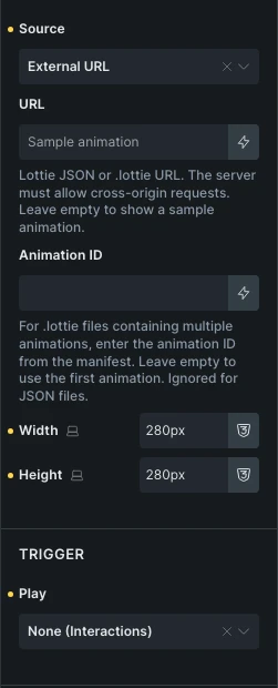
2. Choose a **Source**:
- **File**: Select a Lottie JSON or `.lottie` attachment.
- **External URL**: Enter a public animation URL. The server must allow cross-origin requests. Leaving the URL empty shows the bundled sample animation.
- **Dynamic data**: Select media supplied by a dynamic-data tag.
3. Set **Width** and **Height** if the animation needs a specific size.
4. Choose when it should play, then save and check the frontend.
For a `.lottie` file containing several animations, enter the manifest's **Animation ID**. Leave it empty to use the first animation. The setting has no effect on JSON files.
Bricks enables JSON and `.lottie` uploads for users who can upload files in WordPress and have permission to add the Lottie element. Other site upload restrictions still apply. If an upload is rejected, check those permissions and the site’s allowed file types.
A remote URL must return the animation file itself, rather than a web page containing a player.
## Choose when to play
Use **Play** to choose the trigger:
| Play setting | Behavior |
| ----------------------- | ----------------------------------------------------------------------------------------------------------------------------------------- |
| **On page load** | Start after the animation loads. |
| **When visible** | Play when the element enters the viewport. Choose **Reset and replay** or **Pause and resume** under **On leaving viewport**. |
| **On hover or focus** | Play when the trigger receives pointer hover or keyboard focus. **On mouse leave** can reset, pause, reverse, or finish the current play. |
| **On click** | Choose **Play and pause**, **Play from start**, or **Play forward, then reverse**. |
| **Sync with scroll** | Advance through the animation as the element moves through the viewport. |
| **None (Interactions)** | Control playback through Bricks interactions. |
**Delay (ms)** postpones playback for **On page load** and **When visible**. The default is `0`. With **Pause and resume**, the delay applies to the initial start, not resuming playback. Use **Delay between loops** to pause between repeats.
For **When visible**, enable **Play once** to disable looping and automatic replay after completion until the page reloads.
For hover and click, **Trigger element** can be **Self**, **Parent**, or **CSS selector**. A custom selector uses the closest matching ancestor first, then the first matching element on the page. Use **Parent** when an illustration should respond to its containing card.
### Sync with scroll
**Start (%)** controls where the element's top edge starts playback, measured from the bottom of the viewport (`0`) to the top (`100`). **End (%)** controls where its bottom edge finishes playback. The defaults are `0` and `100`.
Scroll playback follows scroll progress. Loop, loop count, loop delay, and speed controls do not apply in this mode.
## Playback settings
- **Loop**: Repeat playback. Enabled by default.
- **Loop count**: Number of plays. Leave empty for continuous looping.
- **Delay between loops (ms)**: Pause between repeats.
- **Speed**: Playback multiplier, from `0.1` to `10`. The default is `1`.
- **Direction**: Play forward or in reverse.
- **Start frame** and **End frame**: Limit playback to a section of the animation. Leave empty to use its full length.
- **Frame when stopped**: Show the first or last frame before playback and after a reset.
- **Lazy load**: Load the animation near the viewport. Enabled by default. Global or page-level **Disable lazy load** settings override it.
## Control playback with interactions
To play an animation from a separate Button:
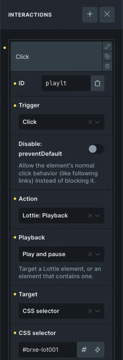
1. Set the Lottie element's **Play** to **None (Interactions)**.
2. Add a **Click** interaction to the Button.
3. Choose **Lottie: Playback** as the action.
4. Choose **Play**, **Pause**, **Play and pause**, **Stop**, or **Play from start**.
5. Target the Lottie element, or a wrapper containing it, through the interaction target controls.
6. Save and test the Button on the frontend.
Use separate play and pause controls if visitors need to control a repeating animation. See [Interactions](/builder/features/interactions/) for trigger and target setup.
## Accessibility and reduced motion
Add a **Text alternative** when the animation conveys information. Leave it empty for decorative animations. A Lottie element that uses itself as a hover or click trigger is keyboard focusable; give it a meaningful text alternative so its purpose is clear.
When a visitor prefers reduced motion, Bricks shows the selected **Frame when stopped** instead of playing the animation. Keep essential text and actions outside the animation so they remain available in that state.
## Troubleshooting
- **Animation could not be loaded**: Check that the URL returns a supported JSON or `.lottie` file and that a remote host permits cross-origin requests.
- **Wrong animation in a .lottie file**: Check **Animation ID** against the file's manifest.
- **Animation starts only after scrolling**: Check **Lazy load** and the selected **Play** trigger.
- **A card does not trigger playback**: Check **Trigger element** and the custom CSS selector. For a keyboard-triggered card, the card itself must be focusable.