Custom Attributes
Bricks 1.3 introduces the possibility to add your own custom HTML attributes to any element.
You can add custom attributes under “Style > Attributes”. Set a “Name” and a “Value” and your attribute(s) will be added to the elements’ most relevant node. By default, your attributes are added to the element root node. Besides manually entered values you can populate custom attribute values with dynamic data, too.
In there you’ll be able to insert multiple attributes (name and value). Dynamic Data is rendered for attribute values on the frontend.
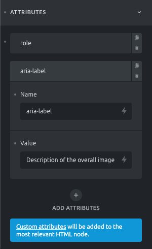
Container: Custom Attributes
Let’s say you want to add an ARIA role and label to a container that contains multiple images that should be considered as a single image. You’d add the following two attributes when editing your container:
- Attribute #1 name: role
- Attribute #1 value: img
- Attribute #2 name: aria-label
- Attribute #2 value: Description of the overall image
This results in the following container HTML:
<div id="brxe-sfglik" class="brxe-sfglik brxe-container" role="img" aria-label="Description of the overall image">... Container elements ...</div>Custom attributes take precedence over default attributes. So if you set a custom alt attribute when editing your image, this custom attribute will be used instead of the default image alt attribute.
Elements where custom attributes are added to the following specific HTML tags:
| Bricks Element | HTML tag |
|---|---|
| Nav Menu | <nav> |
| Heading | <h1> or any other heading tag |
| Text | <div> |
| Button | <button> or <a> depending if there is a link |
| Image | <img> |
| Video | <div> |
| Form | <form> |
How To Add Tooltips
Section titled “How To Add Tooltips”Bricks comes with built-in (CSS-only) tooltips that you can set via custom attributes.
Make sure to set the attribute “Name” to data-balloon and the value to whatever you want your tooltip text to be. You also have to set a second HTML attribute named data-balloon-pos and then set the value to whatever you want your tooltip to be positioned like:
- top | top-right | top-left
- right
- bottom | bottom-right | bottom-left
- left
For a full list of all available tooltip HTML attributes please visit the official website of the Balloon.css library Bricks uses for its tooltips: https://kazzkiq.github.io/balloon.css/
Resources:
Section titled “Resources:”- HTML attribute reference: https://developer.mozilla.org/en-US/docs/Web/HTML/Attributes
Was this helpful?
A quick vote and short notes help us improve these docs faster.
Leave a note for us
Please do not include passwords, license keys, or personal data. We store submitted notes to improve the docs.
Thanks for sharing feedback. We're using it to improve these docs.