Interactions
Interactions, available since Bricks 1.6, let you run an action when something happens on the front end. A simple interaction can show a hidden element on click. A more advanced interaction can listen for a query AJAX event, check browser storage, fetch an AJAX popup with the right post context, or call a custom JavaScript function.
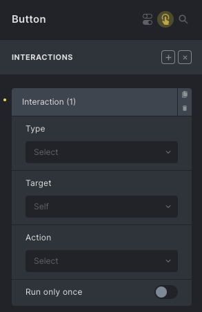
An interaction has three main parts:
- Trigger: the event Bricks listens for, such as click, content loaded, scroll, enter viewport, form success, or query AJAX end.
- Action: the behavior Bricks runs, such as show, hide, toggle a class, scroll to an element, open a popup, load more results, or run a JavaScript function.
- Target: the element affected by the action. Depending on the action, the target can be the same element, a CSS selector, or a popup template.
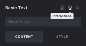
Accessing interactions
Section titled “Accessing interactions”When editing an element, click the “Interactions” toggle icon in the panel header to open or close the element interactions interface.
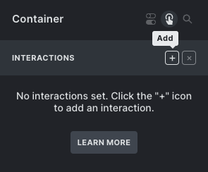
If an element has interactions, the same icon appears in the structure panel. Click the icon to open that element’s interactions.
Adding interactions
Section titled “Adding interactions”Click the ”+” icon next to the “Interactions” title to add an interaction. You can add multiple interactions to the same element. Clicking the title of a specific interaction lets you rename it.
Each interaction receives its own ID. Bricks uses this ID internally, and you can copy it when another interaction needs to listen for a specific animation-end event.
Triggers
Section titled “Triggers”The Trigger determines when the interaction runs.
Element triggers
Section titled “Element triggers”Element triggers listen on the source element:
- Click
- Hover
- Focus
- Blur
- Mouse enter
- Mouse leave
- Enter viewport
- Leave viewport
- Animation end
- Query AJAX loader: Start / End
- Form Submit, Form Success, Form Error
Click interactions call event.preventDefault() by default. Since Bricks 2.0, you can enable Disable: preventDefault for a click interaction if the clicked element should keep its normal browser behavior, such as following a link.
Enter viewport supports a rootMargin setting since Bricks 2.0. For example, 0px 0px -50% 0px can make the interaction trigger when the element reaches a more specific viewport position. Leave viewport does not use rootMargin.
Browser and window triggers
Section titled “Browser and window triggers”Browser/window triggers are not tied to a single element event:
- Scroll
- Content loaded
- Mouse leave window
The scroll trigger accepts a scroll offset. Bricks supports pixel values, percentage values based on the document height, and vh values based on the viewport height. Content loaded accepts a delay such as 500ms or 1s.
The Run only once control is available for most triggers, but not for Content loaded.
Query filter triggers
Section titled “Query filter triggers”When Query Filters are enabled, Bricks adds:
- Filter: Empty
- Filter: Not empty
These triggers listen for a specific filter element ID. You can enter the raw Bricks ID, #id, or #brxe-id; Bricks normalizes it before comparing.
Supported filter types are:
- Active filters
- Checkbox
- Datepicker
- Radio
- Range
- Search
- Select
For Active filters, Checkbox, Radio, and Select, Bricks checks whether options or values are available. Select excludes the placeholder option, and Checkbox/Radio exclude the “All” option. For Datepicker and Search, Bricks checks whether the current value is empty. For Range, Bricks checks whether the selected range differs from the filter’s min/max values.
WooCommerce triggers
Section titled “WooCommerce triggers”When WooCommerce is active, Bricks adds WooCommerce interaction triggers:
- Added to cart
- Adding to cart
- Removed from cart
- Cart updated
- Coupon applied
- Coupon removed
These triggers rely on WooCommerce’s frontend jQuery events. They only run when the matching WooCommerce event is emitted on the page.
Actions
Section titled “Actions”The Action is what Bricks runs after the trigger passes any conditions.
Available actions:
- Show element
- Hide element
- Click element
- Set attribute
- Remove attribute
- Toggle attribute
- Toggle offcanvas
- Load more (Query loop)
- Load more (Image Gallery)
- Start animation
- Scroll to
- JavaScript (Function)
- Open address (Map)
- Close address (Map)
- Clear form
- Browser storage: Add
- Browser storage: Remove
- Browser storage: Count
Show and Hide can target regular elements or popup templates. For regular elements, Bricks changes the inline display style. For popups, Bricks calls the popup open/close logic.
Set, Remove, and Toggle attribute work on the selected target. If the attribute key is class, Bricks adds, removes, or toggles class names via classList; otherwise it sets or removes the attribute itself.
The Click element action calls .click() on each target element. This is useful when you want one UI control to trigger another existing control.
The Clear form action clears inputs, textareas, selects, checkboxes, radios, and visible file results. Hidden inputs are not cleared. If the interaction is triggered by Form Submit, Form Success, or Form Error, Bricks clears the matching form. Otherwise, you can provide a target form selector; if no selector is provided, Bricks clears all forms on the page.
Map actions are available since Bricks 2.0. Use Open address (Map) and Close address (Map) when working with Map/Info Box popups and address interactions.
Targets
Section titled “Targets”Most actions use one of these target modes:
- Self: run on the source element.
- CSS selector: run on every element matching the selector.
- Popup: run on a selected popup template.
Some actions do not use the standard target control because they have their own target field or no target at all. Examples include Load more, Browser storage, Toggle offcanvas, Map actions, and Clear form.
When a popup interaction is inside a query loop, Bricks first tries to match the popup by both the selected popup template ID and the current loop item ID. If no loop-specific popup is found, it falls back to the popup template ID.
Run only once
Section titled “Run only once”Enable Run only once when the interaction should only run one time during the current page lifecycle. For normal element events, Bricks uses a one-time event listener. For document-level events such as form, AJAX, popup, filter, or WooCommerce events, Bricks tracks and removes the interaction after it runs.
Run only once is page-local. It is not stored across page loads. Use Browser storage actions and interaction conditions if you need a persistent or session-based rule.
Action: Scroll to
Section titled “Action: Scroll to”Use Scroll to to move the page to the target element. The action supports:
- Offset (px): subtracts pixels from the target position.
- Delay (ms): waits before scrolling. Bricks uses a small delay by default so the DOM can update first.
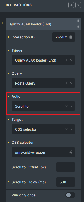
In this example, after the “Posts Query” AJAX call finishes, the page scrolls to the element with the CSS selector #my-grid-wrapper, waiting 500 milliseconds first.
Action: Toggle offcanvas
Section titled “Action: Toggle offcanvas”Since Bricks 1.11, interactions can toggle an Offcanvas element from any element. Set the action to Toggle offcanvas and provide the Offcanvas CSS selector, such as #brxe-off123.
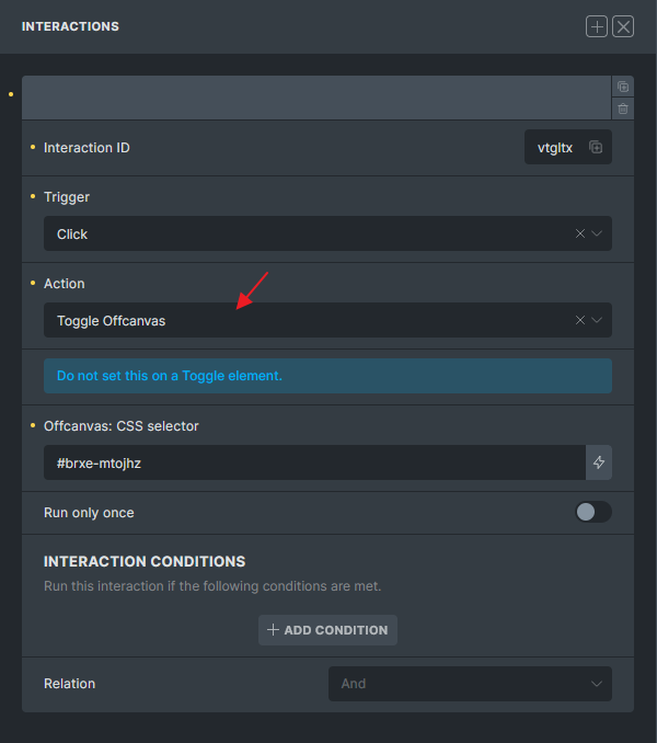
Do not apply this action directly to the Toggle element itself.
Browser storage
Section titled “Browser storage”Browser storage actions let an interaction write, remove, or count a key:
- Window storage: stored on
window; resets on page load. - Session storage: stored in
sessionStorage; normally resets when the browser tab/session ends. - Local storage: stored in
localStorage; persists until cleared.
The storage actions use the same Key field as attribute actions:
- Browser storage: Add writes the configured value to the key.
- Browser storage: Remove removes the key.
- Browser storage: Count reads the key as a number, defaults to
0, increments it by one, and stores the result.
Storage is especially useful with interaction conditions. For example, one interaction can count how many times a button was clicked, while another interaction only runs when that count is greater than 2.
Action: JavaScript (Function)
Section titled “Action: JavaScript (Function)”Since Bricks 1.9.5, interactions can execute your own JavaScript functions.
Define your functions globally:
<script>window.myHelperFunctions = {}
myHelperFunctions.myCall = () => {  console.log('myCall executed')}
myHelperFunctions.nestedFn = {  fn1: () => {    console.log('fn1 executed')  },  fn2: () => {    console.log('fn2 executed')  }}
function toggleMiniCart() {  const run = () => {    document.querySelector('.bricks-woo-toggle').dispatchEvent(new Event('click'))  }
  setTimeout(run, 100)}</script>
Enter the function name in the Function name (JavaScript) field without parentheses and without window.:
myHelperFunctions.myCallmyHelperFunctions.nestedFn.fn1myHelperFunctions.nestedFn.fn2toggleMiniCart
You cannot execute run() from the example above because it is scoped inside toggleMiniCart(), not on window.
JavaScript function arguments
Section titled “JavaScript function arguments”Use the Arguments repeater to pass values to your function. The %brx% placeholder passes a Bricks object with interaction context:
source: the source element that triggered the interaction.targets: the array of resolved target elements.target: the current target element for this function call.
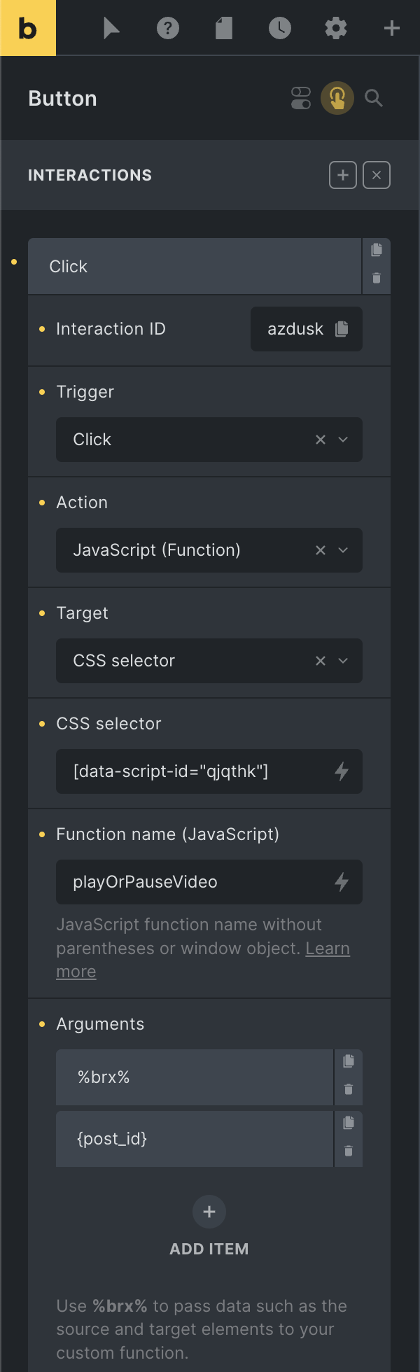
function playOrPauseVideo(brxParam, postId) {  const target = brxParam?.target || false
  if (!target) {    return  }
  const video = target.querySelector('video')
  if (!video || !video.play || !video.pause) {    return  }
  if (video.paused) {    video.play()  } else {    video.pause()  }}
Interaction conditions
Section titled “Interaction conditions”Interaction conditions let an interaction run only when browser storage matches your rules. Conditions support:
- Window storage
- Session storage
- Local storage
Each condition checks a storage key with one of these comparisons:
- Exists
- Not exists
==!=>=<=><
For numeric comparisons, Bricks converts the stored value and comparison value to numbers. Non-numeric values become 0 for those comparisons.
The Relation setting controls whether all conditions must pass or whether any condition can pass:
- And: every condition must be true.
- Or: at least one condition must be true.
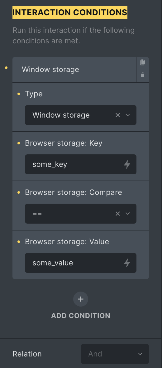
The example above runs when window.some_key equals some_value.
Animations
Section titled “Animations”Bricks uses Animate.css for interaction animations.
Action: Start animation
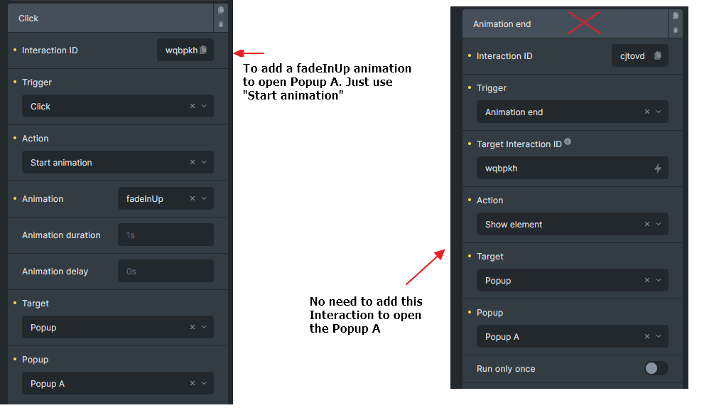
Section titled “Action: Start animation”Set action to Start animation and choose an animation type, duration, and optional delay.
When the target is a popup, Bricks applies the animation to .brx-popup-content. If the animation name includes In, Bricks opens the popup. If a popup content animation includes Out, Bricks closes the popup after the animation ends.
Popup animation behavior
Section titled “Popup animation behavior”Popups handle open and close animations directly. To open or close a popup after an animation, set the interaction action to Start animation and choose an animation ending in In or Out.
You do not need a second interaction that listens for the animation-end trigger only to open or close the popup.
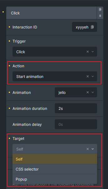
Trigger: Animation end
Section titled “Trigger: Animation end”Since Bricks 1.8.4, Animation end can run another interaction after a Start animation action finishes.
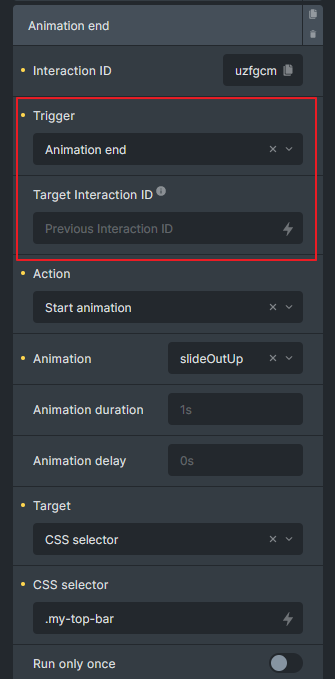
Use Target interaction ID to listen for a specific Start animation interaction. If you leave it empty, Bricks looks for the previous Start animation interaction in the same interaction group.
If the target ID points to the current interaction, or to an interaction that is not a Start animation action, Bricks ignores it.
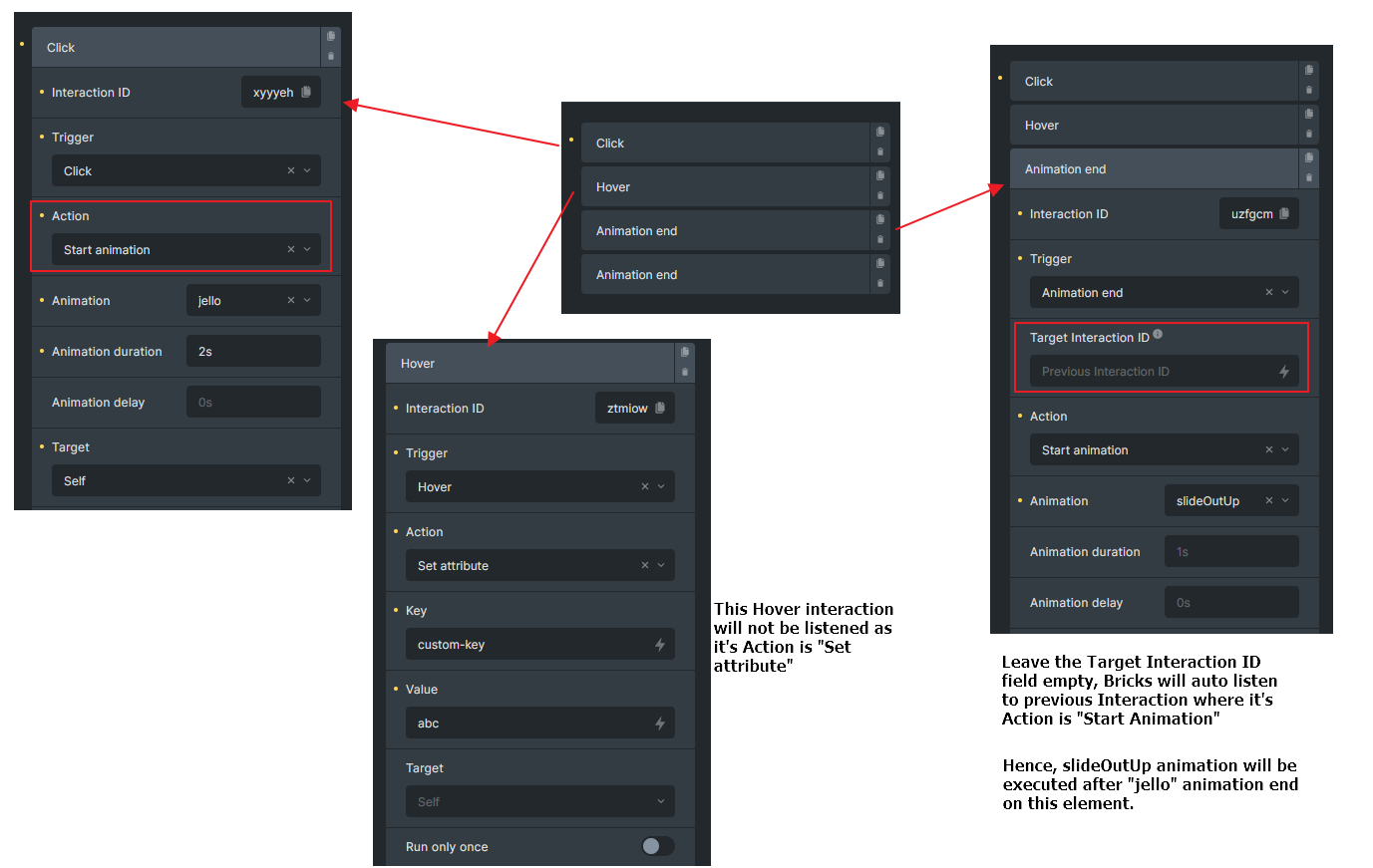
In this example, interaction uzfgcm runs after the xyyyeh animation ends.
You can also listen for the same JavaScript event:
document.addEventListener('bricks/animation/end/xyyyeh', (event) => {  const element = event.detail.el || false
  if (!element) {    return  }
  // Your logic here})
Query AJAX loader triggers
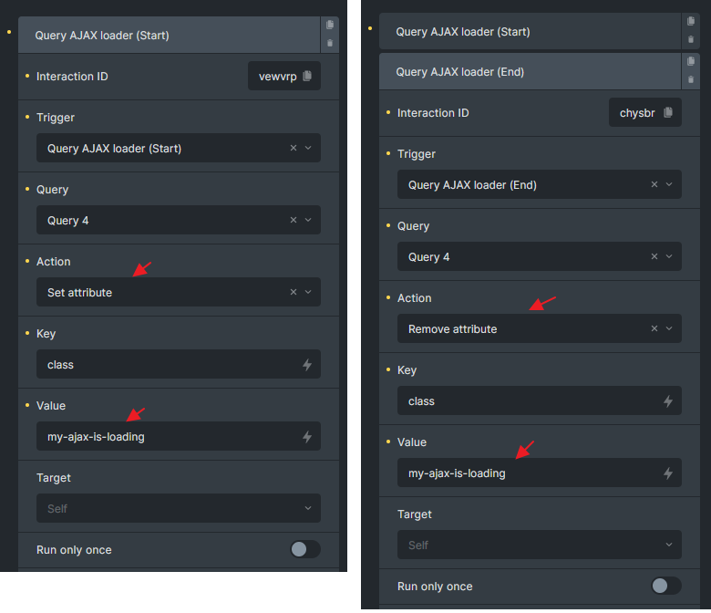
Section titled “Query AJAX loader triggers”Query AJAX loader triggers were introduced in Bricks 1.9. They listen to Bricks AJAX start/end events for a selected query ID.
Use Query AJAX loader (Start) to run an action before a query AJAX request starts, and Query AJAX loader (End) to run an action after it completes.
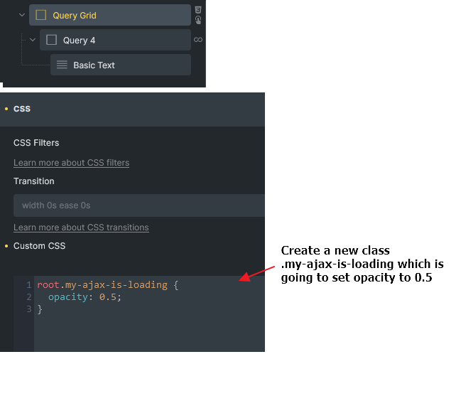
Example: Apply opacity during AJAX loading
Section titled “Example: Apply opacity during AJAX loading”- Create a grid layout for your query loop and add a custom class that sets opacity to
0.5. - Add one interaction to apply the class when AJAX starts.
- Add another interaction to remove the class when AJAX ends.
You can also listen to the underlying JavaScript events:
document.addEventListener('bricks/ajax/start', (event) => {  const queryId = event.detail.queryId || false
  if (!queryId) {    return  }
  // Your logic here})
Form triggers
Section titled “Form triggers”Since Bricks 1.9.2, interactions can listen to Bricks form events.
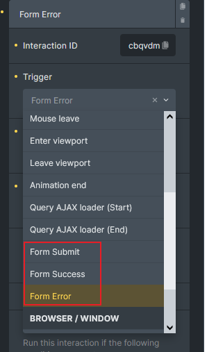
Triggers: Form Submit, Form Success, Form Error
Trigger: Form Submit
Section titled “Trigger: Form Submit”Form Submit runs after Bricks has prepared the form data and before the AJAX form request is sent.
document.addEventListener('bricks/form/submit', (event) => {  const elementId = event.detail.elementId  const formData = event.detail.formData
  console.log('Element ID:', elementId)  console.log('Form Data:', formData)})
Trigger: Form Success
Section titled “Trigger: Form Success”Form Success runs after a successful form AJAX response.
document.addEventListener('bricks/form/success', (event) => {  const elementId = event.detail.elementId  const formData = event.detail.formData  const res = event.detail.res
  // Your logic here})
Trigger: Form Error
Section titled “Trigger: Form Error”Form Error runs after an error form AJAX response.
document.addEventListener('bricks/form/error', (event) => {  const elementId = event.detail.elementId  const formData = event.detail.formData  const res = event.detail.res
  // Your logic here})
When configuring a form trigger in the Interactions panel, provide the Form ID. Bricks accepts values such as abcde, #abcde, or #brxe-abcde and compares them against the form element ID.
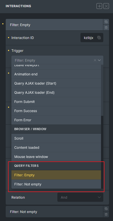
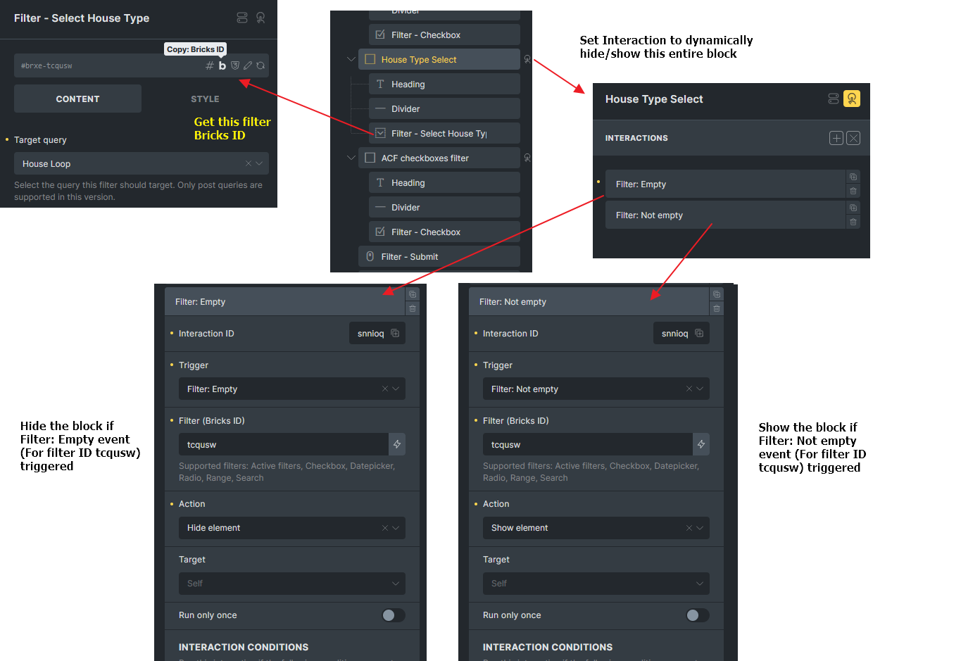
Trigger: Filter: Empty / Not Empty
Section titled “Trigger: Filter: Empty / Not Empty”Filter: Empty and Filter: Not Empty were introduced in Bricks 1.11 and are available when the Query Filters feature is active.
Use them to hide, show, or otherwise update UI around filter elements whose options or values become empty after the initial page load or after a query filter AJAX update.
Filter: Empty runs when:
- Active filters have no rendered content.
- Checkbox, Radio, or Select has no available options, excluding “All” or placeholder options.
- Datepicker or Search has an empty current value.
- Range is still at its min/max default.
Filter: Not Empty runs when:
- Active filters have rendered content.
- Checkbox, Radio, or Select has available options.
- Datepicker or Search has a current value.
- Range differs from its min/max default.
Example: If a Filter - Select returns no options, hide its wrapper to avoid an empty control. Add the matching Not Empty interaction to show the wrapper again when options return.
Popup example
Section titled “Popup example”To open a newsletter popup from a footer button:
- Create a Popup template named “Newsletter popup”.
- Set the popup template conditions to the pages where the popup should be available, such as Entire website.
- Add a button in the footer.
- Add a Click interaction to the button.
- Set the target to Popup, select the Newsletter popup template, and use Show element.
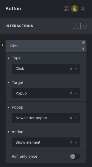
Now the button opens that popup wherever the popup template is rendered.
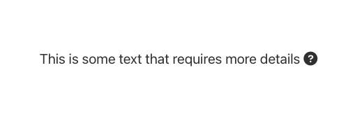
Example: Show custom tooltip on hover
Section titled “Example: Show custom tooltip on hover”Create a hidden tooltip element, such as a Div with the class .my-tooltip, near an Icon element.
Add two interactions to the Icon:
- Hover or Mouse enter: show
.my-tooltip. - Mouse leave: hide
.my-tooltip.
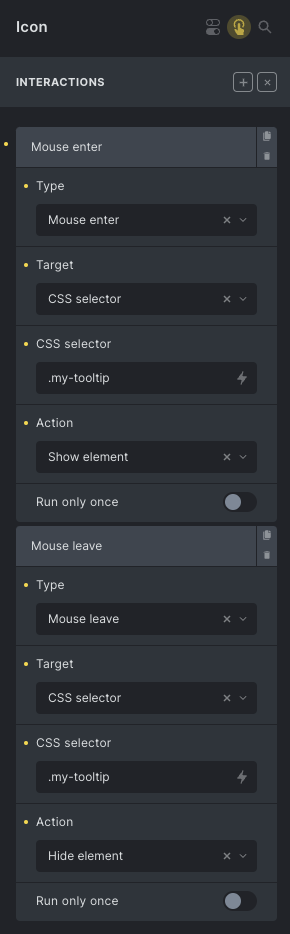
The result can look like this:

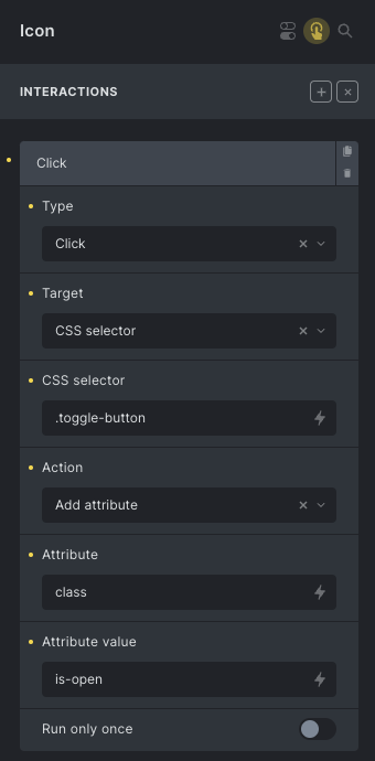
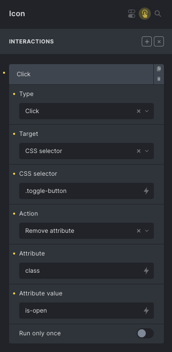
Example: Create a toggle button
Section titled “Example: Create a toggle button”You can build a custom toggle button with two Icon elements inside a Div.
Add a custom class .toggle-button to the wrapper Div and use CSS like this:
%root% .toggle-close-icon {  display: none;}
%root%.is-open .toggle-open-icon {  display: none;}
%root%.is-open .toggle-close-icon {  display: block;}
Give the default icon the class .toggle-open-icon, and the active icon the class .toggle-close-icon.
Then add interactions:
- On the default icon, add class
is-opento the wrapper. - On the active icon, remove class
is-openfrom the wrapper.
Was this helpful?
A quick vote and short notes help us improve these docs faster.
Leave a note for us
Please do not include passwords, license keys, or personal data. We store submitted notes to improve the docs.
Thanks for sharing feedback. We're using it to improve these docs.