
Fluid Typography
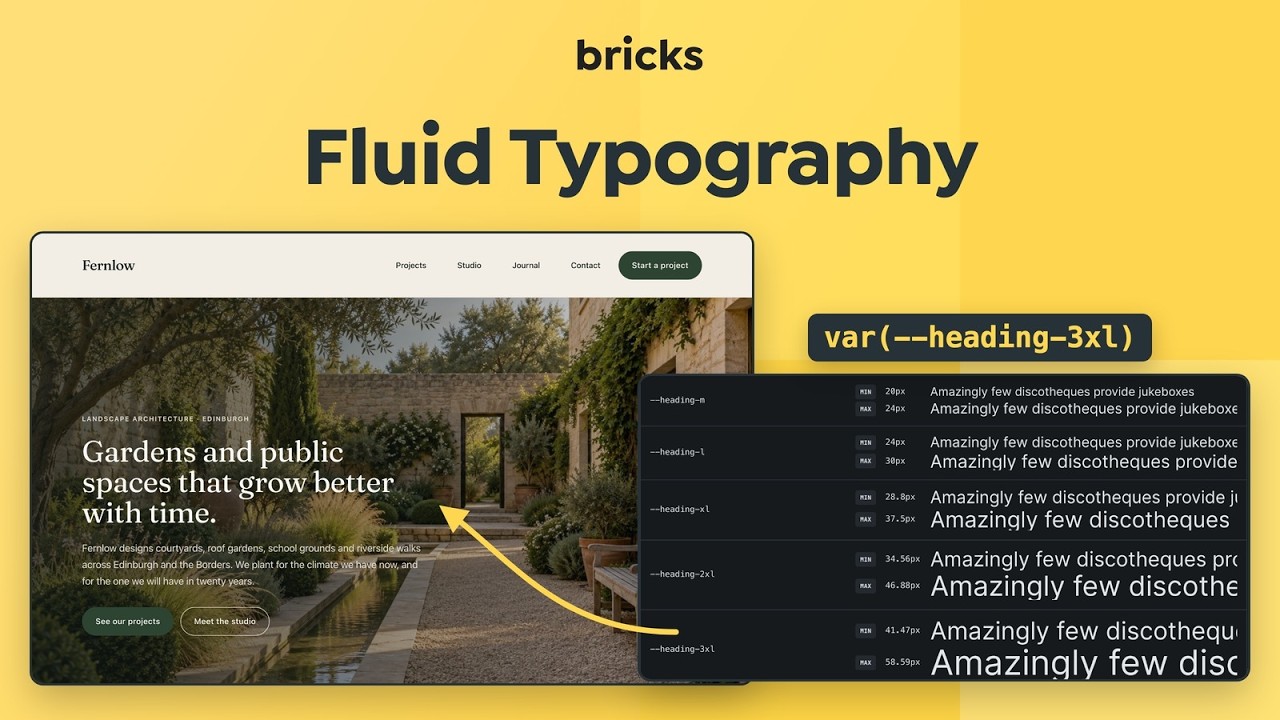
Starting with Bricks 2.1, the Fluid Typography Generator lets you create pixel-perfect & responsive font sizes (through CSS variables using clamp) that scale smoothly between defined minimum and maximum values, ensuring consistent readability across all screen sizes and devices. Simplifying the process of managing font sizes while maintaining flexibility and precision in your design.
Accessing fluid typography
Section titled “Accessing fluid typography”Open the Style Manager from the builder toolbar, then select Typography in the Style Manager sidebar. From there you can create and edit fluid typography scales.
Global scale settings, including the HTML font-size used for rem calculations and the minimum and maximum screen widths, are available in the Style Manager settings.
Spacing scales for padding, margins and gaps work the same way in the Spacing tab. See Fluid Spacing.
Fluid typography categories
Section titled “Fluid typography categories”Bricks lets you create unlimited Fluid Typography Scales for your Headings, Text, etc. through categories.
So, every Category is a Fluid Typography Scale, that stores all its scale settings alongside it.
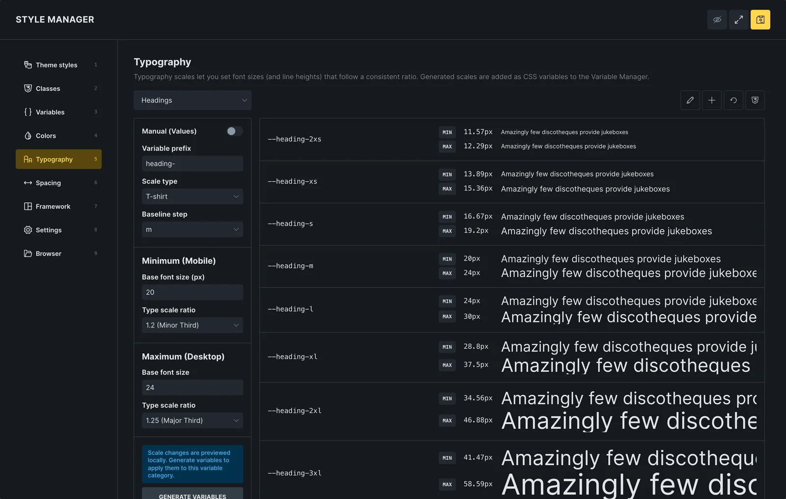
You can keep it simple and just create a Headings and Text category for those two scales as we did in the following screenshot:

Fluid typography variables
Section titled “Fluid typography variables”Fluid typography variables can be generated with the Scale Generator on the right-hand side.
Scale changes are previewed in the list first. Click Regenerate variables to create or update the variables of the category (without pending changes, the button reads Generate variables). The icon in the Style Manager header, Regenerate variables and save, does both in one step.
Whenever variables are generated, all existing variables within the selected category are deleted and replaced with the newly created variables. If the category already has variables, Bricks asks you to confirm this first. The number of variables is the same as in the previous set, but the names and values will be regenerated. So, any manual edits made to variable names or values are lost once the variables are regenerated. As long as the number of steps and the scale type stay the same, the names stay the same too, so every place that uses a variable (for example var(--heading-xl)) picks up the new value.
Scale controls
Section titled “Scale controls”Variable prefix
Section titled “Variable prefix”The prefix determines how variable names are structured. For instance, setting the prefix to text- results in variables being named --text-m or --text-xl, depending on the scale. It is recommended to use a prefix that is both unique and descriptive to maintain clarity and avoid conflicts.
Scale type
Section titled “Scale type”The scale type specifies the naming convention used for fluid typography variables:
- T-shirt: Generates variable names based on standard t-shirt sizes, such as
2xs, xs, s, m, l, xl, 2xl. An example output would be--text-m. - Numeric: Generates variable names using numbers, typically ranging from 1 through 6. An example output would be
--text-4. - Numeric (reverse) (since 2.5): Generates descending numbers, such as
6, 5, 4, 3, 2, 1. In automatic mode, with ratios greater than 1 and a prefix ofh, a six-step scale produces--h6through--h1, from the smallest to the largest generated font size. - Custom: Allows complete manual control over the naming convention. For example, scale names such as
small, medium, large, titlecould be entered, resulting in variable names such as--text-medium.
Custom scale type
Section titled “Custom scale type”This control only shows when the scale type is set to Custom. It provides the ability to define custom scale names, offering flexibility in aligning the naming convention with project-specific requirements.
Baseline step
Section titled “Baseline step”The baseline step acts as the foundation of the scale. The baseline variable will directly reflect the minimum and maximum font sizes defined, and all other scale steps will be calculated relative to this baseline. Proper definition of the baseline ensures accurate scaling across all steps.
HTML font-size
Section titled “HTML font-size”The Style Manager HTML font-size setting defines the rem baseline used for scale generation. You can set it explicitly to 10px or 16px, or leave it on auto so Bricks resolves the value from Theme Styles where possible and otherwise falls back to the default.
Base font size (px)
Section titled “Base font size (px)”The scale settings have two groups, Minimum (Mobile) and Maximum (Desktop). Each has its own base font size and type scale ratio (defaults: 16px with 1.25, and 20px with 1.333). The two base font sizes establish the minimum and maximum values for the baseline step. Font sizes for all other steps will be calculated automatically based on the defined Type Scale Ratio.
Screen width (px)
Section titled “Screen width (px)”The minimum and maximum screen widths are set once in the Style Manager settings and apply to all scales (default: 360px and 1440px). At the minimum width every step uses its minimum size, at the maximum width its maximum size. Outside these widths, font sizes stay constant.
Type scale ratio
Section titled “Type scale ratio”This control defines the ratio by which font sizes increase or decrease in relation to the next adjacent variable. For example, with a baseline of 16px and a scale ratio of 1.5, the next step above the baseline will be calculated as 24px. Ratios are applied upward and downward, generating consistent scaling in both directions. Because the minimum and maximum have their own ratio, a larger ratio for large screens gives more contrast between headings on desktop while keeping them compact on phones. Steps below the baseline then shrink more on large screens, so for the smallest steps the maximum value can end up below the minimum.
For advanced use cases, it is possible to enter a custom ratio. A new control for defining custom values becomes available only when the Custom option is selected. This allows precise manual control over how each step in the scale is calculated.
Editing variables
Section titled “Editing variables”Once generated, variables are displayed in the central panel. These variables may be managed in several ways.

Adding variables
Section titled “Adding variables”Hover over the first or the last step in the list. A + button on its left edge adds a step: above the first row it adds a smaller step, below the last row a larger one (for example 3xl after 2xl).
The new step is inserted at the appropriate position, either above or below the baseline. Both the variable name and value are automatically generated.
In cases where the Custom scale type is used, variable names may need to be updated manually, or additional values can be added directly in the custom scale definition.
Note: If you used the Custom scale type, then you will need to update the variable name, or even better, add new value to the Custom scale directly.
Deleting variables
Section titled “Deleting variables”To remove the smallest or the largest step, hover over the first or last row and click the − button. Bricks prevents removing the baseline step because the other steps depend on it.
Editing variables
Section titled “Editing variables”Variable names and values can be directly edited by selecting them in the center column. Manual edits apply only to the selected variable and do not affect any calculations. This allows fine-tuned adjustments while maintaining overall scale consistency.
Using the variables
Section titled “Using the variables”Generated variables appear in the variable picker of every size control, grouped by their category. To give all headings of the same level one size across the site, set them in a theme style: Theme Styles > Typography > Heading H1 (H2, H3 …) > Typography > Font size, then pick the variable, for example var(--heading-xl) for H2.
A font size set directly on an element, including a size set on a breakpoint, takes precedence over the theme style. Clear those sizes on the elements that should follow the theme style. For an element that should deliberately differ, such as a larger hero headline, pick another step of the same scale instead of typing a value.
Typography preview
Section titled “Typography preview”The list in the center shows every step of the scale with its minimum and maximum size, each rendered as a line of preview text. Changes to the scale settings are previewed in this list right away. They reach the variables only after you click Regenerate variables.
The eye icon in the Style Manager header toggles the canvas preview, so you can see the page next to the Style Manager while you work.
Was this helpful?
A quick vote and short notes help us improve these docs faster.
Leave a note for us
Please do not include passwords, license keys, or personal data. We store submitted notes to improve the docs.
Thanks for sharing feedback. We're using it to improve these docs.