
Tabs (nestable)
The Tabs (nestable) element groups content into tabs. Each title and content pane contains editable Bricks elements. Since Bricks 2.5, the same content can switch to an accordion layout on smaller screens.
Settings
Section titled “Settings”-
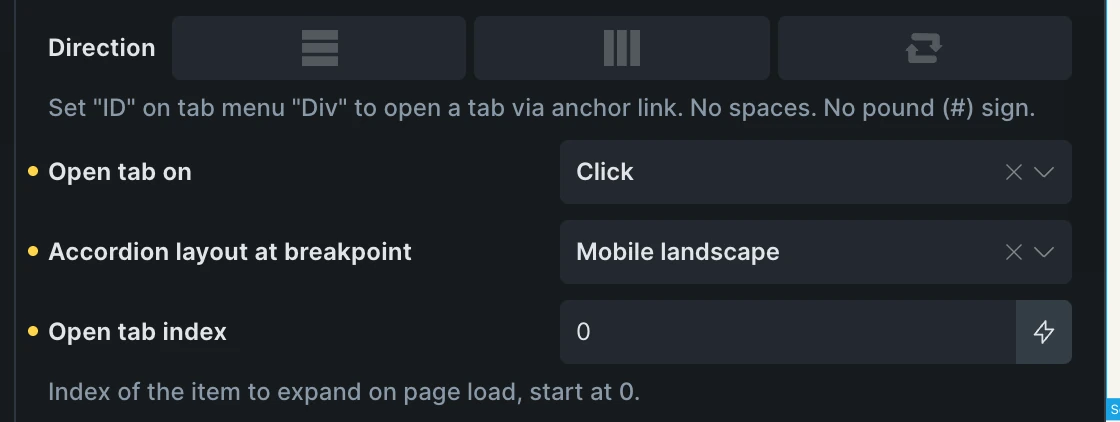
Direction (direction) - Layout direction of the tabs. Controls the
flex-directionCSS property. Set “ID” on tab menu “Div” to open a tab via anchor link (no spaces, no pound sign). -
Open tab on (select) - Trigger for opening tabs. Options:
click,hover. Default:click. -
Open tab index (text) - Index of the tab to expand on page load, starting at 0. Default: 0. A matching custom ID set on a tab title opens that tab when used in the URL hash.
-
Accordion layout at breakpoint (select) - Switch to an accordion below the selected breakpoint width. Default: None. Choose from the site’s configured breakpoints.
Accordion layout
Section titled “Accordion layout”Select the Tabs (nestable) element and choose Accordion layout at breakpoint. For example, choose Mobile landscape to keep a horizontal menu on wider screens and place each title directly above its content on narrower screens.
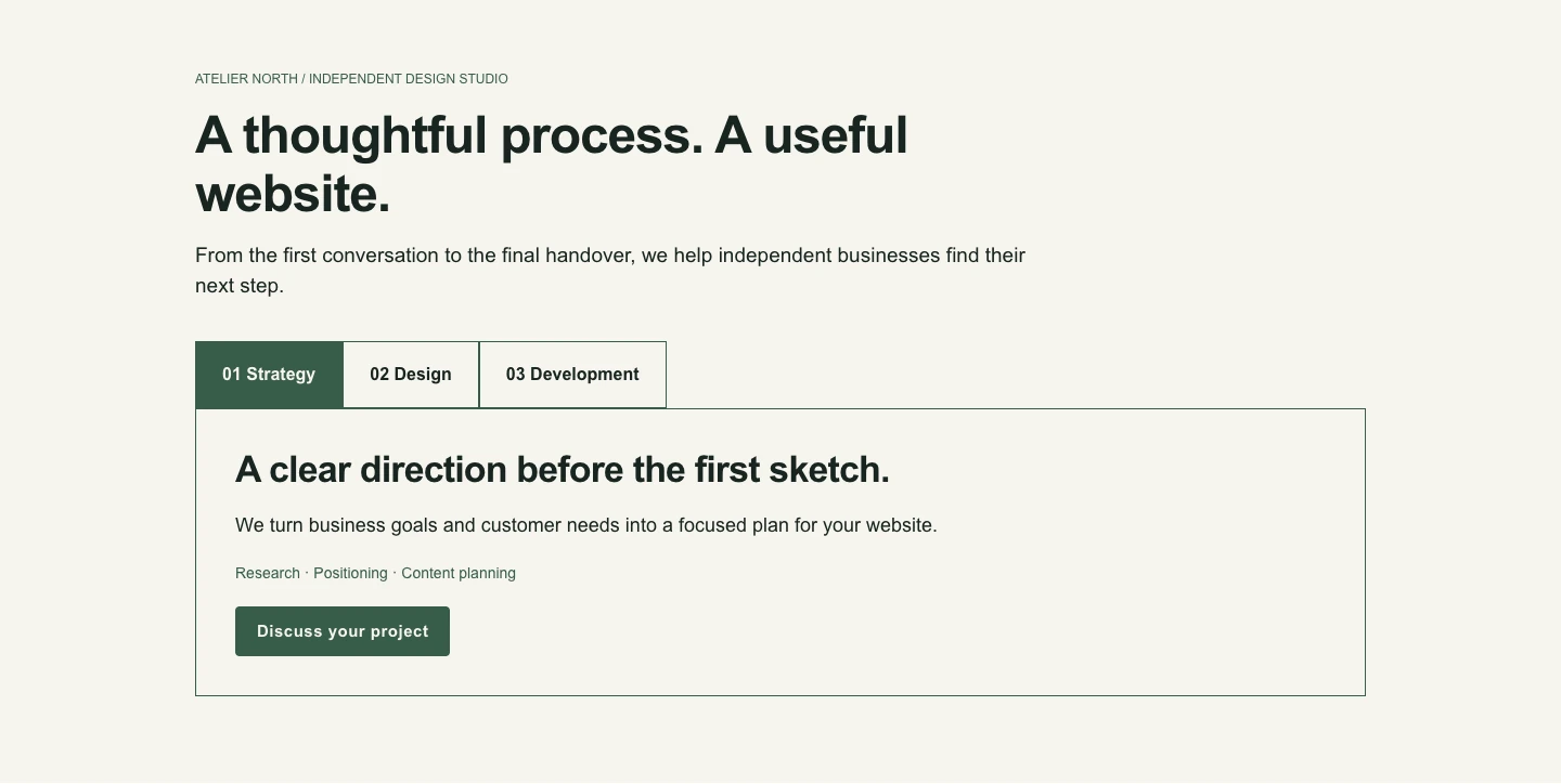
The accordion applies strictly below the selected width. At that width and above, Bricks restores the tabs layout. For a breakpoint width of 767px, the accordion appears below 767px, and tabs appear at 767px and above.
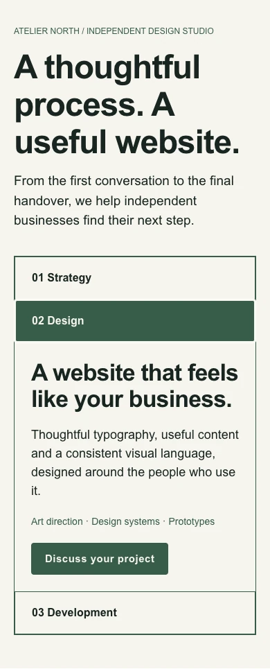
Both layouts use the same titles and content. Selecting another title opens its pane and closes the previous one. The Open tab index sets the initial pane; you do not need to create separate mobile content.
In accordion layout, use TAB to move between titles and ENTER or SPACE to open a pane. Titles configured to open on hover remain operable by click and keyboard. Links and form controls nested inside a title keep their own behavior.
Keep the native Tab menu and Tab content structure, with matching title and pane counts. Panes must be direct children of Tab content for the accordion layout to work. Wrapping the panes in an extra element keeps the ordinary tabs layout.
Styling
Section titled “Styling”Title styles apply in both layouts. In accordion layout, Content → Padding applies inside each pane so it does not indent the titles.
-
Width (number with units) - Width of tab titles. Default:
auto. -
Margin (spacing) - Margin around tab titles.
-
Padding (spacing) - Padding inside tab titles. Default:
20px(top, right, bottom, left). -
Background (color) - Background color of tab titles.
-
Border (border) - Border styling for tab titles.
-
Typography (typography) - Font styling for tab titles.
Active
Section titled “Active”-
Background color (color) - Background color of active tab titles. Default:
#dddedf. -
Border (border) - Border styling for active tab titles.
-
Typography (typography) - Font styling for active tab titles.
Content
Section titled “Content”-
Margin (spacing) - Margin around tab content.
-
Padding (spacing) - Padding inside tab content. Default:
20px(top, right, bottom, left). -
Text color (color) - Text color of tab content.
-
Background color (color) - Background color of tab content.
-
Border (border) - Border styling for tab content. Default:
1px solid(all sides).
Was this helpful?
A quick vote and short notes help us improve these docs faster.
Leave a note for us
Please do not include passwords, license keys, or personal data. We store submitted notes to improve the docs.
Thanks for sharing feedback. We're using it to improve these docs.