
Filter checkbox
Creates a checkbox filter interface for AJAX-powered content filtering. Users can select multiple options to narrow down query results. Supports taxonomy terms, WordPress fields, and custom fields as filter sources.
For initial setup, see Query Filters.
Settings
Section titled “Settings”- Target query (query-list) - Select the post, term, or user query this filter should target. Available sources depend on the query type.
- URL parameter (text) - Define a unique, more readable URL parameter name for this filter.
- Apply on (select) - Choose when to apply the filter. Options: Input (immediate), Submit (requires button click). Default: Input.
- Source (select) - Data source for filter options. Options: Taxonomy, WordPress field, Custom field.
- Field type (select) - Type of field when using WordPress field or custom field source. Options: Post, Term, User.
- Field (select) - Specific field to filter by (varies based on field type).
- Taxonomy (select) - Taxonomy to use for filtering when source is taxonomy.
- Order by (select) - How to order taxonomy terms. Options: Name, Slug, Term ID, Description, Parent, Count, Include, Menu Order, Meta Value, Meta Value Num.
- Order meta key (text) - Meta key for ordering when using meta value ordering.
- Order (select) - Sort direction. Options: ASC, DESC. Default: ASC.
- Terms: Include (select) - Specific taxonomy terms to include in filter options.
- Terms: Exclude (select) - Specific taxonomy terms to exclude from filter options.
- Top level terms only (checkbox) - Display only top-level terms (parent = 0) when source is taxonomy.
- Hide count (checkbox) - Hide the result count for each option.
- Count: Include children (checkbox, Bricks 2.5) - Include descendant-term posts in parent taxonomy counts. Off by default. Requires a target query and a selected taxonomy. See taxonomy child counts.
- Hide empty (checkbox) - Hide options with zero results.
- Hide count bracket (checkbox) - Remove brackets around count values. Style count via .brx-option-count.
- Provider (select) - Custom field provider for integration (ACF, Meta Box, etc.).
- Meta key (text) - Custom field key for filtering.
- Compare (select) - Comparison operator for filtering. Options: IN, NOT IN, BETWEEN, NOT BETWEEN.
- Mode (select) - Display mode for checkboxes. Options: Default (traditional checkboxes), Button (modern button style).
- Active filter - Settings for active filter display.
- Prefix (text) - Text to display before filter value.
- Suffix (text) - Text to display after filter value.
- Title (text) - Custom title attribute for filter links.
Collapsible Taxonomy Branches
Section titled “Collapsible Taxonomy Branches”Starting with Bricks 2.5, visitors can expand and collapse child branches in a hierarchical taxonomy Checkbox filter. This is useful for category lists where showing every nested term would make the filter too long.
- Set Target query, choose Taxonomy as the source, and select a taxonomy with parent and child terms.
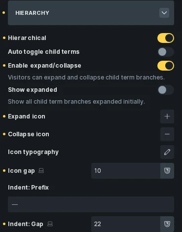
- Open the Hierarchy control group and enable Hierarchical.
- Turn on Enable expand/collapse.
- Leave Show expanded off to start with branches collapsed, or enable it to show all branches expanded initially.
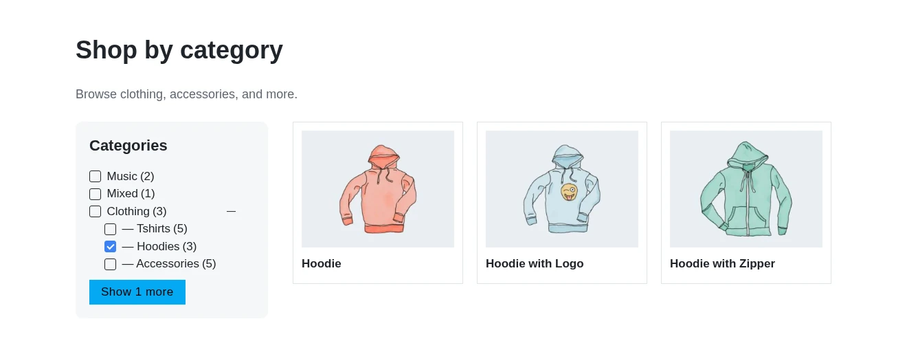
- Save and check the frontend. Parent terms with visible children have a separate expand/collapse button beside the checkbox.
| Hierarchy setting | Behavior |
|---|---|
| Hierarchical | Arrange taxonomy terms under their parents. |
| Auto toggle child terms | Toggle child checkboxes when a parent checkbox changes. This is separate from expanding a branch. |
| Enable expand/collapse | Add buttons to open and close child branches. Off by default. |
| Show expanded | Expand all branches initially. Off by default. |
| Expand icon / Collapse icon | Choose the disclosure icons. Defaults are plus and minus. |
| Icon typography / Icon gap | Set the icon appearance and spacing. |
| Indent: Prefix / Indent: Gap | Set child-term indentation in the default display mode. |
The disclosure button opens or closes a branch without selecting its checkbox. Visitors can focus the button and use Enter or Space to toggle it. Selected child terms open their ancestor branches on page load, including selections loaded from URL parameters. Bricks preserves each element’s expanded branches through AJAX updates and opens the path to selected terms when needed.
Only terms present in the filter’s options can appear in a branch. Top level terms only, term exclusions, and Hide empty can remove child options. If a parent has no visible children, it has no expand/collapse button. Use Count: Include children if parent counts should include posts assigned to descendants.
Show More/Less With Branches
Section titled “Show More/Less With Branches”In the Show more / Show less control group, set Visible options limit to limit the initial list. Leave it empty to show all options.
When Enable expand/collapse is on, this limit counts whole root branches, not individual child terms. For example, a limit of three shows the first three root branches. Expanding one of them reveals its children without using up another place in the limit. Show more reveals the remaining root branches; Show less returns to the initial limit.
A branch containing a selected term stays visible even beyond the limit, so the list can show more than the configured number of roots. Show more: Text accepts %number% for the number of hidden root branches. In the collapsed list, the Show more button is hidden when no additional branches remain hidden. Without expand/collapse, the limit counts individual options.
Linked Desktop and Mobile Filters
Section titled “Linked Desktop and Mobile Filters”When using a global filter, Hierarchical, Auto toggle child terms, and Count: Include children are shared settings. Expand/collapse, Show expanded, icons, indentation, and Show more/less limits stay on each element.
Linked elements targeting the same query synchronize their checkbox selections. Each copy keeps its own expanded branches and Show more/less state, so a mobile filter can start collapsed while the desktop copy starts expanded.
Default selection
Section titled “Default selection”Starting with Bricks 2.5, this filter can apply a selection before the first query runs. Use Default value to preselect exact option values, separated by commas, such as cotton, wool. Use taxonomy slugs or raw stored values rather than display labels. Wrap a value containing a comma in double quotes. Dynamic data is supported.
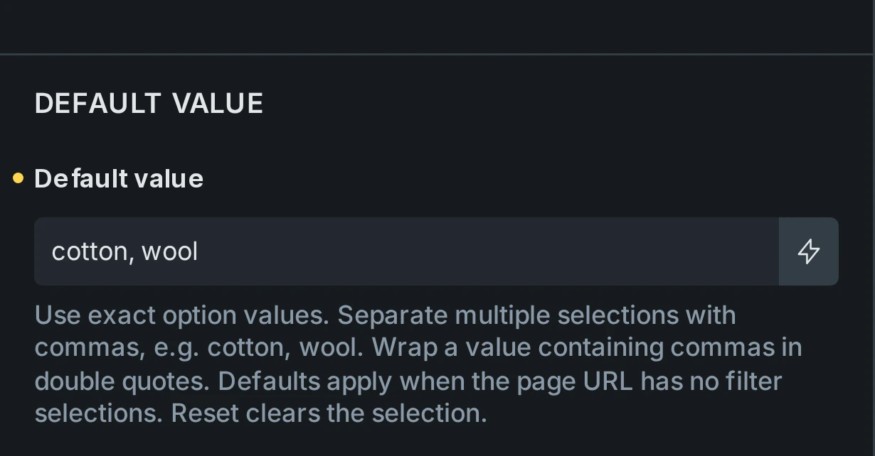
The default applies even with Apply on set to Submit. Filter URL selections take precedence, and Reset clears the selection instead of restoring the default. A fresh visit or reload without filter parameters applies it again. See default filter values for shared defaults, validation, and URL behavior.
Was this helpful?
A quick vote and short notes help us improve these docs faster.
Leave a note for us
Please do not include passwords, license keys, or personal data. We store submitted notes to improve the docs.
Thanks for sharing feedback. We're using it to improve these docs.