
Form
The Form element lets you build custom forms with the following form field types:
- Text
- Textarea
- Rich text
- Telephone
- Number
- URL
- Image (Media library)
- Gallery (Media library)
- Checkbox
- Select
- Radio
- Files
- Datepicker
- Password
- Remember me
- HTML
- Hidden
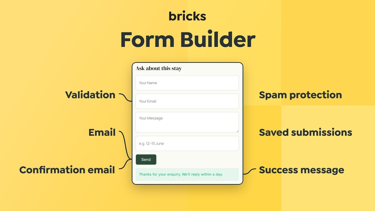
You can define actions triggered by form submissions like sending an email notification, redirecting to a certain page, communicating to SendGrid or Mailchimp servers, or user login/registration. If this is not enough, you can also develop your own actions.
The form element also integrates with Google reCaptcha V3, hCaptcha, and Cloudflare Turnstile to protect your sites from fraudulent activities, spam, and abuse. Supports dynamic data, and form validation through a new action hook.
How the Form element is structured
Section titled “How the Form element is structured”A new Form element starts with three fields: Name (Text), Email (required), and Message (Textarea, required), plus a Send button. Labels are hidden by default and only the placeholders show. Enable Show labels under Fields to display them.
The settings are split into control groups:
- Fields: The form fields and their validation settings. Each field shows its unique six-character ID at the end of its settings.
- Submit button: Text, style, and icon of the submit button.
- Actions: What happens after a valid submission, the Success message, and optional action conditions.
- Notices: When and how success and error messages close.
- One group for each selected action, for example Email, Confirmation email, or Save submission.
- Spam protection: reCAPTCHA, hCaptcha, Turnstile, and honeypot information.
An action’s control group only appears once the action is selected under Actions. A new form has Email selected, so the Email and Confirmation email groups are visible right away.
Select fields
Section titled “Select fields”The Select field is a dropdown for choosing one option. It has no built-in multiple-selection setting. Use a Checkbox field when visitors need to choose several options without custom code.
Starting with Bricks 2.5-beta, a Select field rejects submissions containing more than one value. Custom code or plugins that turn a Select field into a multi-select must explicitly allow multiple values for the intended form and field through the bricks/form/select/allow_multiple PHP filter. Adding a multiple attribute or a name[] suffix alone is insufficient.
Bricks checks this before custom form validation and form actions. Normal single selections continue to work.
Auto-focus field (since 2.5)
Section titled “Auto-focus field (since 2.5)”Use Auto-focus field to focus a field when the frontend page loads, so visitors can start typing without clicking it first.
- Select the Form element.
- Open Content > Fields and add the fields you need.
- In Auto-focus field, select the field to focus.
- Save the page and reload it on the frontend to check the focus.
Leave the setting at None to keep the form from requesting initial focus. The dropdown includes Email, Text, Textarea, Telephone, Number, URL, Select, and Password fields. Honeypots and other field types are excluded.
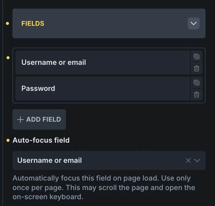
Bricks adds the native HTML autofocus attribute to the selected field on the frontend. It suppresses the attribute in Builder renders so the form does not take focus from the canvas or settings panel. If you delete the selected field or change it to an unsupported type or a honeypot, it no longer receives autofocus.
For a login form, select the username or email field. When that field has focus, pressing Enter can submit the form through the browser’s normal form behavior. Test this on the frontend with your browser’s saved credentials; autofill and Enter behavior can vary between browsers and field types. Autofocus does not change the form’s action mapping or validation.
Field descriptions
Section titled “Field descriptions”Since Bricks 2.5, you can add a Description to each form field. Use it for instructions that visitors need while filling out the form, such as an accepted file format or an explanation of how you will use their email address.
Add a description
Section titled “Add a description”- Select the Form element and open Content > Fields.
- Expand the field you want to describe.
- Enter your instructions in Description.
- Save the page and check the description on the frontend.
For example, add “Include your country code, such as +44.” to a Telephone field. The instructions appear below the input and remain visible while the visitor types.
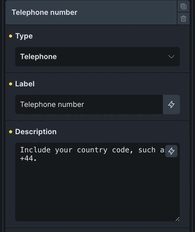
Descriptions appear after the field control. For Checkbox and Radio fields, one description appears below the whole list of options. The setting is available for all interactive field types, including Rich text, Datepicker, Files, Image, and Gallery. Hidden fields, HTML fields, and honeypots do not support descriptions.
Style descriptions
Section titled “Style descriptions”Under Content > Fields, below the field list, find the Description styling section. These settings apply to all field descriptions in that Form element.
Descriptions take up the full width of their field. Bricks does not add description-specific font sizes, colors, or spacing by default, so configure these to suit your form.
Dynamic data and HTML
Section titled “Dynamic data and HTML”The Description field supports dynamic data and HTML, such as links or emphasis. Bricks resolves dynamic data when rendering the field and sanitizes the HTML using WordPress’s allowed post-content markup.
If the description is empty, or has no text after dynamic data is resolved and HTML is sanitized, Bricks outputs no description or accessibility association.
Accessibility
Section titled “Accessibility”Bricks automatically connects each field to its description using aria-describedby, making the instructions available to assistive technology. You do not need to create an ID or add the attribute manually.
For Checkbox and Radio fields, each option is connected to the shared description. Image and Gallery descriptions are connected to the media picker button. Datepicker display inputs and Rich text editors retain the association when initialized on the frontend.
Keep a clear field label as well. The label names the field; the description provides extra instructions. Descriptions do not replace validation messages or enforce requirements such as file types or a password length.
Actions
Section titled “Actions”Form actions run after the form has been submitted successfully.
You may set one or multiple actions for your form. Actions run in the sequence they have been selected, except for the “Redirect” action, which always runs at the very end.
For each selected action, a separate control group appears.
The Success message setting in the Actions group sets the text visitors see after a successful submission. Bricks shows it below the submit button and resets the form fields.
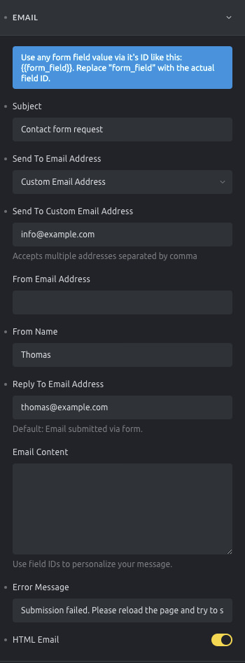
Form element: email action settings
Conditional actions (@since 2.4)
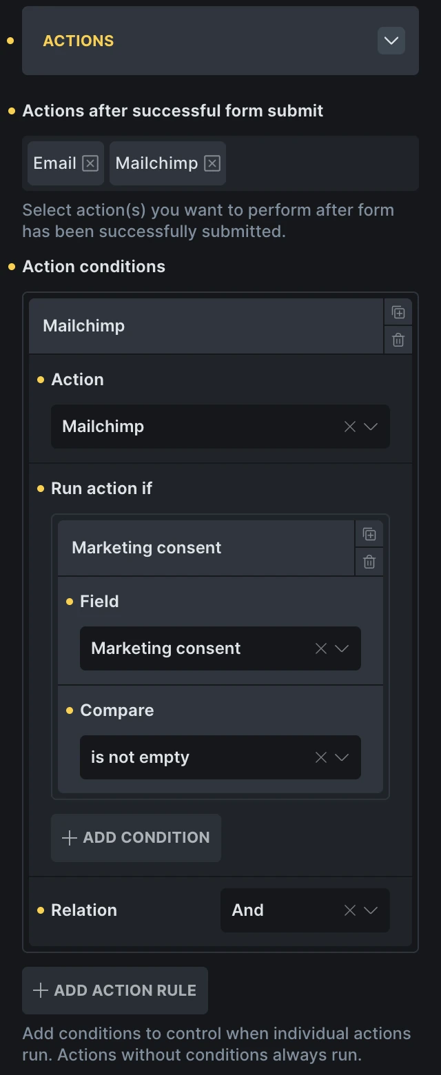
Section titled “Conditional actions (@since 2.4)”Use Action conditions to run a selected action only when submitted form data matches your rules. An action without an action rule always runs after a successful submission.
To add a rule:
- Select every action the form may run under Actions after successful form submit.
- Under Action conditions, click Add action rule.
- Choose the Action to control. The list only includes actions selected for the current form.
- Under Run action if, choose a form Field and a Compare operator.
- Enter a Value when the selected operator requires one.
- Add more conditions if needed, then set Relation to And or Or.
The available comparison operators are:
| Operator | The condition matches when |
|---|---|
| is | A submitted value exactly matches Value. |
| is not | No submitted value exactly matches Value. |
| contains | A submitted value contains Value. |
| does not contain | No submitted value contains Value. |
| is empty | The field has no submitted value. |
| is not empty | The field has a submitted value. |
For fields that can submit multiple values, such as checkboxes, Bricks checks each submitted value. Use is empty or is not empty when the presence of a selection matters more than its exact value.
Example: Subscribe only after consent
Section titled “Example: Subscribe only after consent”A contact form can always send an enquiry email while subscribing only people who select a marketing consent checkbox:
- Add a checkbox field for marketing consent. Do not make it required if visitors must be able to submit the enquiry without subscribing.
- Select both Email and Mailchimp under Actions after successful form submit.
- Add an action rule and select Mailchimp as the action.
- Under Run action if, select the consent checkbox and set Compare to is not empty.
The Email action has no rule, so it runs for every successful submission. Mailchimp runs only when the checkbox has a submitted value.
HTML fields are not available as condition fields because they do not submit values. File-field conditions include newly uploaded files and verified files retained by an Update post form. An incomplete rule, such as a missing field or required comparison value, does not run the action.
The email form action sends one email on form submission. By default, it is configured to send the email to the site administrator email containing all the form fields content.
You may customize the form email action with the following settings:
- Subject: The email subject
- Send to email address: Fill in the email recipients. You may choose to send the email to the website administrator or to a custom email address (it accepts multiple email addresses, separated by a comma)
- BCC email address: Additional recipients who receive a blind copy.
- From email address: The email address that shows as the sender
- From name: The name that shows as the sender. It is only used when From email address is set.
- Reply to email address: In case the recipient replies to the email, this email will be used instead of the “From email address”. If empty, Bricks uses the first email address from the submitted form.
- Email content: In case you want to personalize the email content message. Leave this field empty to send all submitted fields, followed by the URL of the page the form was sent from.
- Error message: The message that will be presented to the site’s user if the email fails for some reason.
- HTML email: Enabled by default. Disable it to send a plain text email.
Confirmation email
Section titled “Confirmation email”Let the person who submitted a form know that you have received their email by automatically sending out a custom confirmation email whenever the form is submitted.
The Confirmation email group belongs to the Email action, so it is only available while Email is selected. The confirmation email is only sent when its Email content is filled in. By default it goes to the email address entered in the form.
We highly recommend properly setting up SMTP to ensure the best possible email delivery from your website. There are plenty of free WordPress plugins available that let you configure this within a few minutes. A search for “WordPress SMTP” should bring up countless articles & plugins for it.
If the “From name” & “From email address” you have set under the “Confirmation Email” settings inside the Form element aren’t used, you have to check if any plugin and/or custom code is overwriting/forcing another name & email address.
Form dynamic fields
Section titled “Form dynamic fields”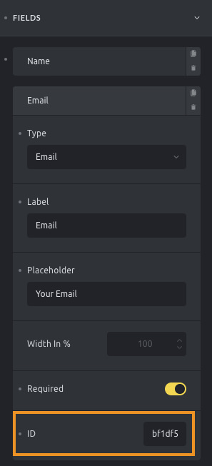
Field ID
In certain scenarios, it could be useful to get some of the submitted form fields’ content to populate the email action settings.
To use the submitted data in your form settings, you have copy & paste the unique field ID (which you’ll find at the end of every form field) and wrap it in two curly brackets like this: {{form_field_id}}
Use those dynamic fields in the “Subject”, “Email address”, “Email content”, “From name”, and “From email” settings.
Regular Bricks dynamic data works in these settings as well. For example, a subject like Enquiry: {post_title} in a single post template includes the title of the post the form was submitted on.
Use the {{referrer_url}} in the above fields to insert the URL of the page where the form was submitted.
To render all submitted fields in the “Email content” use the {{all_fields}} placeholder.
User Login, Registration, Lost Password, and Reset Password
Section titled “User Login, Registration, Lost Password, and Reset Password”These four actions allow you to build custom authentication forms without coding.
When selecting one of these actions, you have to map the form fields appropriately:
- User login: Map the form fields to “Login”, “Password”, and optionally the new “Remember me” checkbox.
- User registration: Map the form fields to “Email”, “Password”, “Username”, and optionally “First/Last name”. If you want to customize the default WordPress emails sent to the admin or new user upon registration, use the following hooks:
wp_new_user_notification_email: Modify the email sent to the user.wp_new_user_notification_email_admin: Modify the email sent to the site admin.
- Lost password: Map the form field to “Email” or “Username” to send reset instructions. If you want to customize the email content for password reset instructions, use the
retrieve_password_messagefilter. - Reset password: Map the form field “password”.
For detailed instructions on configuring custom authentication pages using the Form element, please visit the Authentication Pages article.
Confirm a password
Section titled “Confirm a password”Since Bricks 2.4, a Password field can check that its value matches another Password field in the same form. Use this for registration or password reset forms:
- Add two Password fields, labeled Password and Confirm password.
- Copy the field ID shown at the end of the main Password field’s settings.
- Open the Confirm password field and enable Mark as confirmation password.
- Paste the main field’s ID into Main password field ID, without curly brackets or a
form-field-prefix. - Set Password mismatch error message if you want to replace the default “Passwords do not match” message.
- Map the authentication action’s Password setting to the main field.
Bricks checks the values when the form is submitted. A mismatch prevents the form actions from running. Leaving Main password field ID empty skips the comparison, so always link the confirmation field to the correct field ID.
Matching and required-field validation are separate. Two empty optional fields pass the comparison. Enable Required on both fields when visitors must enter a password.
Redirect
Section titled “Redirect”This form action redirects the user from the form page to a different page on your site. You may set the redirection to the admin area or to a custom URL and set the redirection to happen only after a specific period of time.
The Redirect form action is only triggered after all the other actions run successfully.
Since 1.10, Custom redirect URL field is supporting Form dynamic field tag.
Unlock password protection
Section titled “Unlock password protection”This form action is used to grant access to content protected by Bricks’ password protection feature. You can map the relevant form field to “Password”, but if no field is mapped, the first password field in the form will be used by default.
For more detailed instructions on setting up password protection with forms, please refer to the Password Protection article.
Webhook (@since 2.0)
Section titled “Webhook (@since 2.0)”The Webhook form action, available since version 2.0, sends submitted form data to one or more external URLs.
Typical use cases include:
- Sending leads to CRMs like Zoho, Hubspot, or Salesforce
- Triggering Zapier or Make scenarios
- Storing form data in Google Sheets or external databases
- Notifying internal tools via a custom API or Slack bot
A webhook is simply an HTTP request sent when the form is submitted. You can control what data is sent, how it’s formatted, and whether errors should stop the form.
Setting: Endpoints
Section titled “Setting: Endpoints”You can set up multiple webhook endpoints. Each has these options:
- Name: Label for this webhook (for your reference only)
- Endpoint URL: The URL to send form data to
- Data format: Choose how the data is sent:
JSONorForm data(x-www-form-urlencoded) - Data: Optional payload template using dynamic field tags Leave empty to send all form fields. Example:
{ "name": "{{43f295}}", "email": "{{a5c626}}" }Headers: Optional custom headers in JSON format. Example:
{ "Authorization": "Bearer token" }Setting: Max payload size (KB)
Section titled “Setting: Max payload size (KB)”Set the max size of the request payload.
Default: 1024 (1 MB)
Setting: Rate limiting
Section titled “Setting: Rate limiting”- Rate limiting Enable to limit requests per hour
- Max requests per hour
Set the limit (default:
60)
Setting: Error handling
Section titled “Setting: Error handling”- Continue on error If enabled, form submission succeeds even if the webhook fails
- Error message Message shown if the webhook fails and “Continue on error” is off
Example: Zapier
To trigger a Zap from a form submission, follow these steps:
- In Zapier, create a new Zap
- Choose Webhooks by Zapier as the trigger
- Select Catch Hook
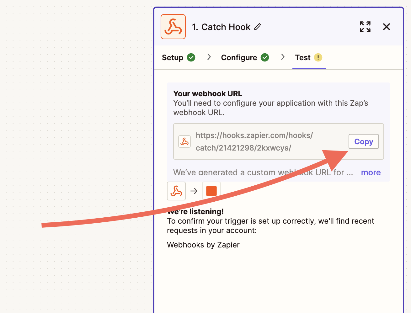
- Copy the webhook URL Zapier gives you
- In Bricks, edit your form and add a Webhook action
- Paste the Zapier URL into the Endpoint URL field
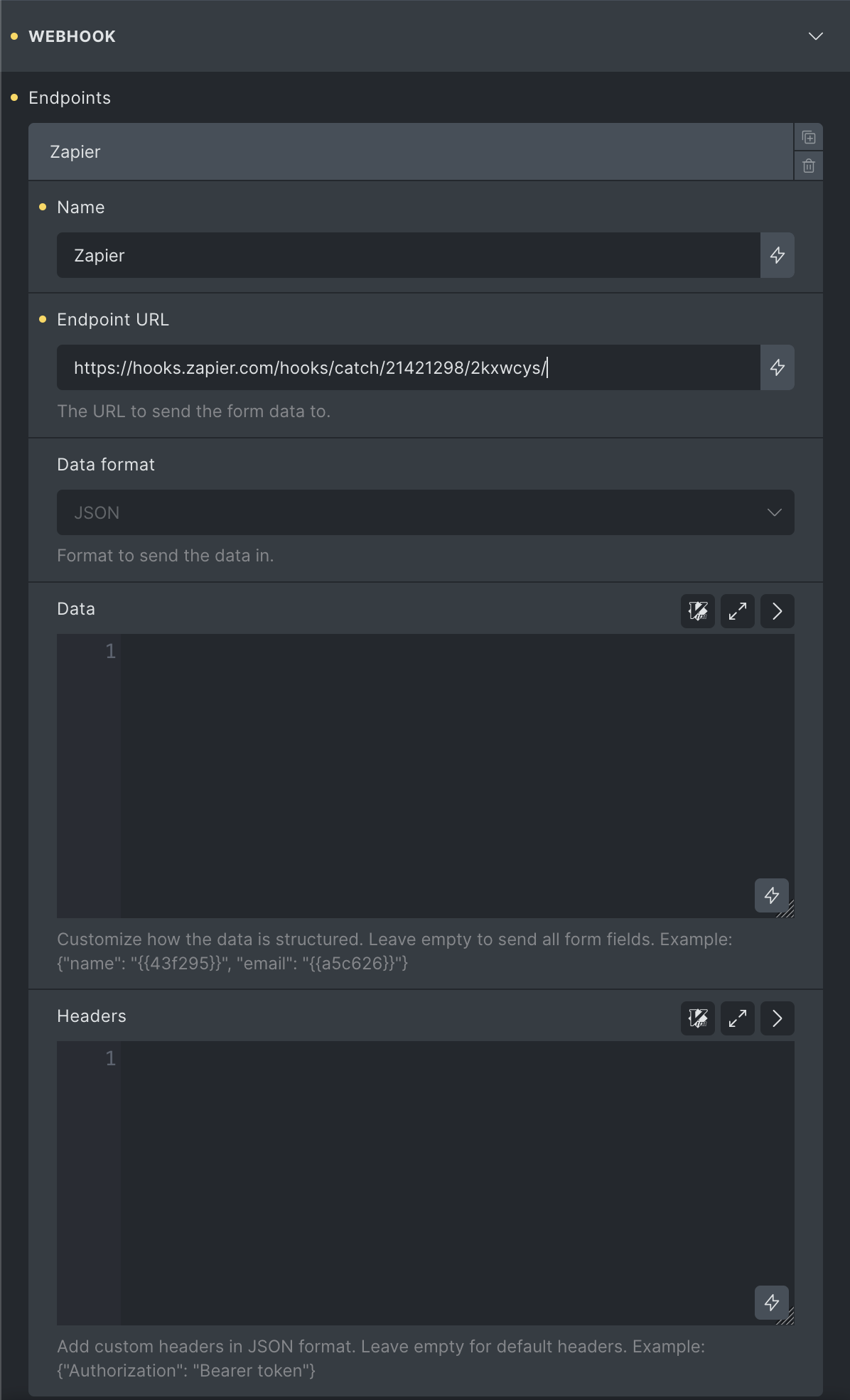
- Set the Data format to
JSON(recommended) - Optionally define the payload or leave it empty to send all fields
- Save and test your form
For full setup instructions, see Zapier’s webhook guide.
Create & update posts (@since 2.1)
Section titled “Create & update posts (@since 2.1)”It is also possible to create powerful frontend forms with Bricks using the “Create post” and “Update post” actions.
More information and examples can be found at /builder/features/create-update-posts-on-the-frontend/
Custom
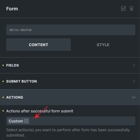
Section titled “Custom”The custom action will allow you to hook into the action bricks/form/custom_action and run your custom code.
Please ensure you have included the Custom in the “Actions after successful form submit” field on your form element when using this hook.
The action callback will receive the $form object which exposes the following methods to get the form settings, the form fields, and the form uploaded files (if needed):
Settings: **$form->get_settings()**
This method exposes an associative array with the form settings (fields and actions settings) similar to this:
Array(    [fields] => Array        (            [0] => Array                (                    [type] => text                    [label] => Name                    [placeholder] => Your Name                    [id] => 15bc57                )
            [1] => Array                (                    [type] => email                    [label] => Email                    [placeholder] => Your Email                    [required] => 1                    [id] => 3db633                )
            [2] => Array                (                    [type] => textarea                    [label] => Message                    [placeholder] => Your Message                    [required] => 1                    [id] => f65f2c                )            ...
        )
    [submitButtonStyle] => primary    [actions] => Array        (            [0] => email            ...        )
    [successMessage] => Message successfully sent. We will get back to you as soon as possible.    [emailSubject] => Contact form request    [emailTo] => admin_email    [fromName] => bricks    [emailErrorMessage] => Submission failed. Please reload the page and try to submit the form again.    [htmlEmail] => 1    [mailchimpPendingMessage] => Please check your email to confirm your subscription.    [mailchimpErrorMessage] => Sorry, but we could not subscribe you.    [sendgridErrorMessage] => Sorry, but we could not subscribe you.    ...)
Fields values: **$form->get_fields()**
This method exposes an associative array with the submitted values for each form field, together with the post Id and the form Id:
Array( [form-field-15bc57] => John Doe [form-field-3db633] => john.doe@example.com [form-field-f65f2c] => Thank you for using Bricks! ... [postId] => 167 [formId] => yrnkmt ... [referrer] => https://example.com/contact)Submitted files: **$form->get_uploaded_files()**
This method exposes an associative array with the properties of the submitted files, grouped by the form field Id:
Array(    [form-field-sajbjc] => Array        (            [0] => Array                (                    [file] => /.../public/wp-content/uploads/2022/03/my-uploaded-file.png                    [url] => https://example.com/wp-content/uploads/2022/03/my-uploaded-file.png                    [type] => image/png                )
            [1] => Array                (                    [file] => /.../public/wp-content/uploads/2022/03/my-other-file.png                    [url] => https://example.com/wp-content/uploads/2022/03/my-other-file.png                    [type] => image/png                )            ...
        )
)
Example #1 Basic setup
<?phpfunction my_form_custom_action( $form ) {  // $fields = $form->get_fields();  // $formId = $fields['formId'];  // $postId = $fields['postId'];  // $settings = $form->get_settings();  // $files = $form->get_uploaded_files();
  // Perform some logic here...
  // Set result in case it fails  $form->set_result([    'action' => 'my_custom_action',    'type'    => 'success', // or 'error' or 'info'    'message' => esc_html__('Oh my custom action failed', 'bricks'),  ]);}add_action( 'bricks/form/custom_action', 'my_form_custom_action', 10, 1 );
Example #2 Trigger a second email after the form is submitted.
With the current Bricks version, you can only set one email notification. With this code snippet, you may trigger a second one.
<?phpfunction my_form_custom_action_sending_email( $form ) {  $fields = $form->get_fields();  // $formId = $fields['formId'];  // $postId = $fields['postId'];  $settings = $form->get_settings();  // $files = $form->get_uploaded_files();

  $to = 'recipient@example.com'; // Replace this  $from = 'sender@example.com'; // Replace this  $subject = 'Your Subject'; // Replace this
  if ( ! empty( $settings['emailContent'] ) ) {    $message = $form->render_data( $settings['emailContent'] );    $message = isset( $settings['htmlEmail'] ) ? nl2br( $message ) : $message;  } else {    $email = new Bricks\Integrations\Form\Actions\Email('email');    $message = $email->get_default_message( $settings, $fields );  }

  $headers[] = 'From: Your Name <'.$from.'>';  $headers[] = 'Reply-to: '. $from;  if ( isset( $settings['htmlEmail'] ) ) {    $headers[] = 'Content-Type: text/html; charset=UTF-8' . "\r\n";  }
  $result = wp_mail( $to, $subject, $message, $headers );
  // $form->set_result([  //  'action' => 'my_custom_action',  //  'type'    => 'success', // or 'error' or 'info'  //  'message' => esc_html__('Oh my custom action failed', 'bricks'),  // ]);}add_action( 'bricks/form/custom_action', 'my_form_custom_action_sending_email', 10, 1 );
Example #3 Custom redirect to a hidden field URL
In certain cases, you would like to redirect user to a page based on certain URL parameter values. In such scenario, you are not able to use {url_parameter:key} on the Custom redirect URL field. This is because the form was submitted in AJAX and the current page URL param will not be sent along the AJAX call.
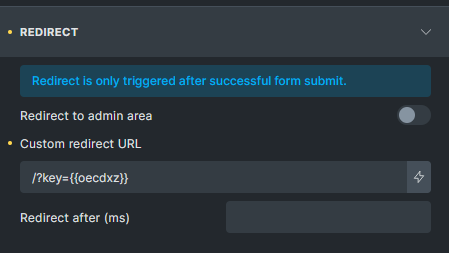
Method 1 Since 1.10, Ridirect action is supporting dynamic form field. You can choose Redirect action and configure like this.
Method 2 You can use Custom action with some PHP code for more complicated logic. You can first place the url parameter into a hidden field.
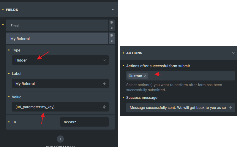
Store url parameter into hidden key, and choose Custom action
Then choose Custom action, and follow below code as an example
<?phpadd_action( 'bricks/form/custom_action', 'redirect_to_my_key', 10, 1 );
function redirect_to_my_key( $form ) {  $form_fields   = $form->get_fields();  $form_id       = $form_fields['formId'];
  // Check if the form id is the one you want  if( $form_id !== 'cyrozb' ) return;
  // oeckxw is the hidden field Id where I placed the {url_parameter:my_key}  $my_key = isset( $form_fields['form-field-oecdxz'] ) ? $form_fields['form-field-oecdxz'] : '';
  if( $my_key ) {    // Now you get the hidden field value and redirect to the page you want, for example:    $redirect_to = get_site_url() . '/?key=' . $my_key;
    // If the hidden field value is a URL, just redirect to it instead of following my code    // $redirect_to = $my_key;
    $form->set_result(      [        'action'          => 'my_custom_redirect', // This is the action name, you can set it to anything you want        'type'            => 'redirect', // Must be set to 'redirect'        'redirectTo'      => $redirect_to,        'redirectTimeout' => 0 // Need to delay ? Set a timeout in milliseconds      ]    );  }}
Custom form actions
Section titled “Custom form actions”Since Bricks 1.12.2, you can extend the functionality of Bricks forms by adding multiple custom form actions. This allows seamless integration with external services like CRMs, email marketing providers, notification systems, or any custom workflows you require.
To create custom actions, you use three key filters:
bricks/elements/{element_name}/controls: Add new actions and their settings to the form builder.bricks/elements/{element_name}/control_groups: Group settings for better organization in the builder.bricks/form/action/{form_action}: Handle the logic for the custom action when the form is submitted.
These filters give you complete control over how custom actions are configured and executed.
Example: Creating a custom Slack notification action
Section titled “Example: Creating a custom Slack notification action”1 - Add the action to form actions setting:
add_filter(    'bricks/elements/form/controls',    function( $controls ) {        $controls['actions']['options']['slack-notification'] = esc_html__( 'Send to Slack', 'bricks' );
        $controls['slackFields'] = [            'group'       => 'slack',            'label'       => esc_html__( 'Fields to include', 'bricks' ),            'type'        => 'select',            'multiple'    => true,            'options'     => [], // Auto-populated with form fields with 'map_fields' => true            'map_fields'  => true,            'description' => esc_html__( 'Select which form fields to include in the Slack notification', 'bricks' ),        ];
        return $controls;    });
2 - Add a new control group:
add_filter(    'bricks/elements/form/control_groups',    function( $control_groups ) {        $control_groups['slack'] = [            'title' => esc_html__( 'Slack notification', 'bricks' ),            'required' => [ 'actions', '=', 'slack-notification' ],        ];
        return $control_groups;    });
3 - Handle the action logic on form submission:
add_action(    'bricks/form/action/slack-notification',    function ( $form ) {        $settings = $form->get_settings();        $fields   = $form->get_fields();
        // Custom Slack notification implementation    });
Form validation
Section titled “Form validation”Bricks 1.7.1 provides a new filter named bricks/form/validate that allows you to validate every form submission and return error messages if your custom validation fails. The first $errors param is an array with each item being an error message. And the second $form param is the instance of the form that has been submitted.
The following code example validates the submitted email address for the form field ID 7e30aa.
If no user account with this email address exists on this site, the validation fails, an error message is displayed, and no email will be sent.
add_filter( 'bricks/form/validate', function( $errors, $form ) {  $form_settings = $form->get_settings();  $form_fields   = $form->get_fields();  $form_id       = $form_fields['formId'];
  // Skip validation: Form ID is not 'kfbqso'  if ( $form_id !== 'kfbqso' ) {    // Early return the $errors array if it's not target form    return $errors;  }
  // Get submitted field value of form field ID '7e30aa'  $email_address = $form->get_field_value( '7e30aa' );
  // Error: Email from registered user (show error message, and don't send email)  if ( ! email_exists( $email_address ) ) {    // Add error message to the $errors message array    $errors[] = esc_html__( 'This email address is not in our system, sorry.', 'bricks' );  }
  // Make sure to always return the $errors array  return $errors;}, 10, 2 );.
Immediate input validation
Section titled “Immediate input validation”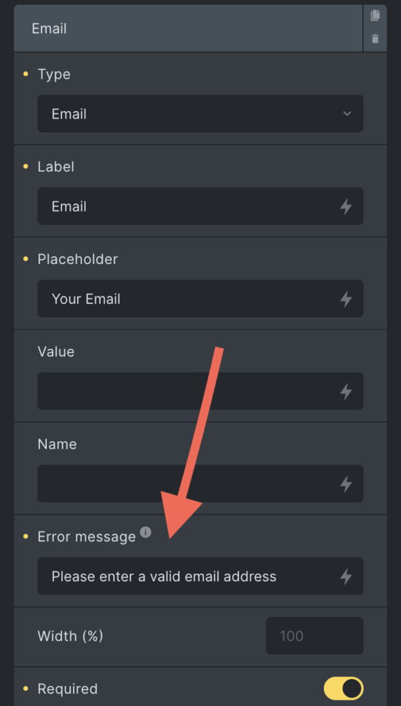
Form field: Error message
Bricks can show an error message directly below a field while the visitor types and when the field loses focus.
To utilize this feature:
- Add an “Error Message” to a specific form field.
- On input and when the field loses focus, the form will evaluate the user input to determine if the “Error Message” should be displayed based on the following criteria:
- Required: Checks if mandatory fields have data.
- Min/Max number: Ensures entered numbers fall within a defined range.
- Email: Confirms the correctness of the email format.
- URL: Validates the structure of inputted URLs.
Fields without an “Error Message” do not show this inline message. The browser’s own validation message appears on submit instead, unless Don’t use browser validation is enabled under Fields.
Disabling immediate input validation
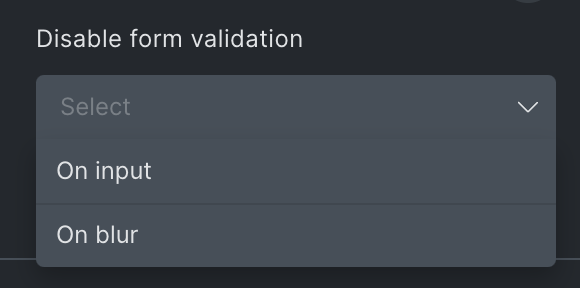
Section titled “Disabling immediate input validation”Sometimes, we don’t want error messages to appear immediately. Instead, we may want to display them only on specific events. This is now possible (@since 1.12) with the new “Disable Form Validation” control.
You can choose to disable validation on input, on blur, or both. However, the form will still be validated upon submission.
Pattern attribute validation
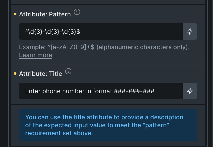
Section titled “Pattern attribute validation”With the new pattern attribute (@since 2.0.2), you can now validate form input natively before submission. Combined with the title attribute (also @since 2.0.2), you can display custom error messages directly from the browser. Make sure the “Don’t use browser validation” toggle it not enabled.
The pattern attribute works with the following field types: text, tel, email, url, and password.
Example:
To require a simple phone number in the ###-###-### format, you can use the pattern ^\d{3}-\d{3}-\d{3}$.
Additionally, you can use the title attribute to guide users or show a helpful message if the input doesn’t match the pattern:
Spam protection (Google reCaptcha V3)
Section titled “Spam protection (Google reCaptcha V3)”The Bricks form element supports the latest Google reCaptcha V3 mechanism. To enable it, first, create a site key and a site secret key and then add both in your admin area under “Bricks > Settings > API keys”.
After adding the keys, enable the reCaptcha setting when editing the Form element in the builder under the “Spam Protection” control group.
The reCAPTCHA, hCaptcha, and Turnstile settings only appear once their keys are saved. Until then, the Spam protection group shows a note that links to Bricks > Settings > API keys. A honeypot field needs no keys.
If you still get a lot of spam, you might need to tweak the score threshold level. The threshold is configured to 0.5 by default. Google reCaptcha V3 API returns a value between 0.0 and 1.0, where 0.0 is very likely a bot, and 1.0 is very likely a human interaction. To increase the Bricks threshold, please use the following PHP snippet:
add_filter( 'bricks/form/recaptcha_score_threshold', function( $score ) { // Bricks default is 0.5 $score = 0.8; return $score;}, 10, 1 );Setting the threshold to 0.8 means Bricks will only accept form submissions with higher scores (more likely to be human interactions).
Spam protection (hCaptcha)
Section titled “Spam protection (hCaptcha)”Bricks integrates with hCaptcha. To utilize it, add your hCaptcha Sitekey and hCaptcha Secret Key under “Bricks > Settings > API keys”.
After adding the keys, enable the hCaptcha setting when editing the Form element in the builder under the “Spam Protection” control group. You’ll find options to select either “Invisible” or “Visible” hCaptcha. For the “Visible” hCaptcha:
- Theme: Choose between a
darkorlighttheme. - Size: Pick from
compactornormal.
For detailed setup instructions, refer to the hCaptcha documentation.
Automated form testing
Section titled “Automated form testing”For automated tests on a staging or test site, use hCaptcha’s test keys. Test keys do not provide anti-bot protection and must not be used on a production form.
Keep production monitoring separate from the public form, for example by testing the same setup on staging or using a dedicated protected monitoring form.
Spam Protection (Cloudflare Turnstile)
Section titled “Spam Protection (Cloudflare Turnstile)”Beginning with version 1.9.2, Bricks has introduced support for Cloudflare Turnstile. To leverage its capabilities, first, add your Cloudflare Turnstile site key & secret key under “Bricks > Settings > API keys”.
After registering the necessary details, go to the Form element in the builder and look for the “Spam Protection” control group. Here, you can toggle the Cloudflare Turnstile setting on or off.
Once enabled, you will have the ability to customize the following:
- Theme: Select between a “dark”, “light”, or the default “auto” theme.
- Size: Opt for either “compact” or “normal”.
For more details about getting your site key and secret key, refer to the Cloudflare Turnstile documentation.
Honeypot
Section titled “Honeypot”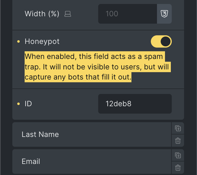
Another spam protection layer, available since Bricks 1.12.2 is the ability to turn any form field (except “Files”, “Remember me”, “HTML” and “Hidden”) into a honeypot field. This won’t affect or interrupt actual website visitors, but it’ll prevent bot form submissions if they fill out any of your honeypot fields.
Date and time picker fields
Section titled “Date and time picker fields”Use a Datepicker field to let visitors select a date, a date with a time, or a time on its own. Bricks 2.5 adds Disable calendar for time-only selection and 24-hour time to control the hour display in the picker.
Select the Form element, open a field under Fields, and set Type to Datepicker.
| Selection | Field settings |
|---|---|
| Date only | Leave Enable time off. |
| Date and time | Turn Enable time on and leave Disable calendar off. |
| Time only (Bricks 2.5) | Turn both Enable time and Disable calendar on. |
Existing datepicker fields keep their date selection behavior unless you enable Disable calendar.
Time-only selection (@since 2.5)
Section titled “Time-only selection (@since 2.5)”To collect an appointment time separately from its date:
- Add a Datepicker field and give it a label such as
Appointment time. - Turn on Enable time.
- Turn on Disable calendar. This setting appears after you enable time.
- Set 24-hour time to Enabled if you want hours from
00to23without an AM/PM selector. - Optionally enter Min. time and Max. time, such as
09:00and17:00, to limit the times visitors can select in the picker.
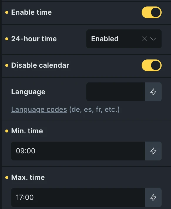
Time-only field settings with 24-hour selection and time limits of 09:00 to 17:00.
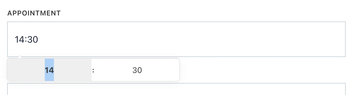
On the frontend, this field opens a time picker without a calendar. To collect the appointment date, add a second Datepicker field and leave Enable time off. Each field has its own value and field ID.
24-hour time (@since 2.5)
Section titled “24-hour time (@since 2.5)”The 24-hour time setting appears when Enable time is on. It applies to both date-and-time and time-only pickers.
| Setting | Picker behavior |
|---|---|
| Default | Uses the WordPress time format under Settings > General to choose the hour display. |
| Enabled | Uses 24-hour selection without an AM/PM selector. |
| Disabled | Uses 12-hour selection with an AM/PM selector. |
This setting changes the controls inside the picker, not the format of the value shown in the form field or submitted with the form. A time-only field uses H:i (24-hour hours and minutes), so selecting 2:30 PM still fills and submits 14:30. A date-and-time field uses the WordPress date format followed by H:i.
These are the built-in formats. Custom code using the datepicker options filter can override them.
Saving time values to post meta
Section titled “Saving time values to post meta”When mapping a time-only field through Create post or Update post, set Sanitization method to Text (sanitize_text_field) to preserve a value such as 14:30. Integer or float sanitization will not preserve the full time string.
With Update post, time-only fields bypass the date conversion used for datepicker fields that include a calendar. Those calendar fields still use the existing Ymd conversion when saving mapped post meta. For example, a date-only selection of October 15, 2026 is saved as 20261015.
See Create & Update Posts on the Frontend for a mapping example and custom-field integration details.
Customize the picker options
Section titled “Customize the picker options”Bricks uses the Flatpickr JavaScript library for date and time selection. Extend or customize the picker using its available options.
To change the library initialization options, use the bricks/element/form/datepicker_options filter, like so:
add_filter( 'bricks/element/form/datepicker_options', function( $options, $element ) {    $options['locale'] = [        'firstDayOfWeek' => 1 // Set Monday as the first week day    ];
    return $options;}, 10, 2 );
The filter callback function accepts two arguments:
- $options - an array of Flatpickr options
- $element - the Bricks element object
Localize the date picker strings
Section titled “Localize the date picker strings”Flatpickr supports l10n for a variety of languages. You would need to load the language package by placing the following instructions into the Bricks Settings > Custom Code > Body (footer) scripts:
<script src="https://npmcdn.com/flatpickr/dist/l10n/XX.js"></script>
<script>   window.flatpickr.localize(window.flatpickr.l10ns.XX)</script>
Replace the XX with the language code you need (e.g. de for German, pt for Portuguese, …).
If you need to adjust the language on a specific form, you would need to load the language package as explained in the first line of the code above but then you may use the Bricks filter to load the language for a specific form element
add_filter( 'bricks/element/form/datepicker_options', function( $options, $element ) {    if ( $element->id === 'abcdef' ) {      // localize the form "abcdef" element      $options['locale'] = 'XX';    }
    return $options;}, 10, 2 );
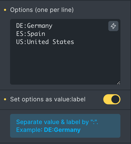
Define options value & label
Section titled “Define options value & label”Starting at Bricks 1.10.2 you can define the value & label for the checkbox, radio, and select field types by separating the option through a colon (:) like this:
Integrations
Section titled “Integrations”The Form element integrates with Mailchimp & Sendgrid. Allowing you to add new contacts to your email lists. Make sure you’ve added your Mailchimp/Sendgrid API keys as described below.
When editing your form element, you have to select Mailchimp or Sendgrid under “Actions” so the form knows to add the submitted email address to your list.
Once you’ve selected the proper action, a new “Mailchimp” or “Sendgrid” control group should appear. There you have to select the list you want to add this new contact to and the “Email field” of your form that contains the email address.
Mailchimp
Section titled “Mailchimp”The Mailchimp form action allows you to automatically communicate your form data (email, first name, and last name) to a Mailchimp list and group.
To use the Mailchimp action, you need to create a Mailchimp account and then get an API key.
To use this form action, add the API key under “Bricks > Settings > API keys > Mailchimp API key”.
SendGrid
Section titled “SendGrid”The SendGrid form action allows you to automatically communicate your form data (email, first name, and last name) to a SendGrid list.
To use the SendGrid action, you need to create a SendGrid account and then get an API key.
To use this form action, add the API key under “Bricks > Settings > API keys > SendGrid API key”.
How to create a multi-column form
Section titled “How to create a multi-column form”To create a multi-column form, we first need to set the “Width” of the form fields in percentage.
Example: Two-column layout
Creating a two-column form is as simple as setting the width of the individual form fields to 50%.
To add some spacing between our form fields, let’s set the “Width” of the first two form fields in our example to 49%. Those fields now take up 98% of the horizontal width. Creating a 2% gap between our columns. Set the bottom “Spacing” value to “2%” to apply the same spacing in all directions.
Lastly, set the “Alignment” to “space-between” to ensure our fields horizontally align with the outer edges of our form.
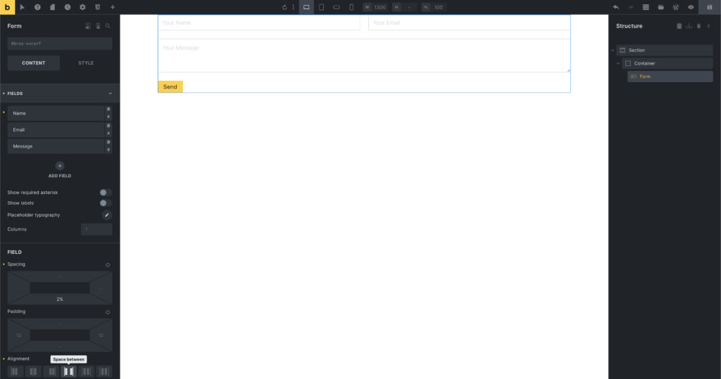
Two-column form layout
Was this helpful?
A quick vote and short notes help us improve these docs faster.
Leave a note for us
Please do not include passwords, license keys, or personal data. We store submitted notes to improve the docs.
Thanks for sharing feedback. We're using it to improve these docs.