Adding & Editing Elements
Elements are the building blocks of a Bricks layout. This article explains how elements are added, selected, nested, styled, reset, copied, and edited in single-element and bulk-edit workflows.
Element mental model
Section titled “Element mental model”A Bricks layout is an element tree. Every element has:
- A type, such as Section, Heading, Image, Button, or Form.
- A unique Bricks ID.
- Optional children if the element can contain other elements.
- A parent, unless it is a root element.
- Settings, which store content, styles, classes, conditions, interactions, custom attributes, and other element-level data.
Root elements sit at the top of the page content. Nested elements sit inside another element. The canvas shows the visual result; the Structure panel shows the actual hierarchy.
Add an element
Section titled “Add an element”Open the Elements panel, then drag an element onto the canvas or into the Structure panel.
Where the element lands depends on the current drop target:
- Drop onto a nestable element to place the new element inside it.
- Drop between siblings to place the new element at that position.
- Drop at root level to create a top-level element.
You can also add layout elements from the Context Menu when an existing nestable element is selected.
Layout elements
Section titled “Layout elements”The current layout elements are Section, Container, Block, and Div.
Use them as structural wrappers:
- Section: Common top-level page section.
- Container: Common content-width wrapper.
- Block: Generic block-level wrapper.
- Div: Generic wrapper with fewer layout assumptions.
Not every element can contain children. Elements that can contain children are nestable. Non-nestable elements, such as many content elements, can be moved, styled, copied, or deleted, but they cannot be used as parents.
Select and edit an element
Section titled “Select and edit an element”Click an element on the canvas or in the Structure panel to select it. The panel switches to the selected element and shows its controls.
The panel header shows the selected element label. You can rename the label to make the Structure panel easier to scan. The label is for builder organization and does not change the HTML tag or frontend text by itself.
The panel can also show quick actions for hide settings, conditions, interactions, Components, and legacy Global Elements depending on the selected element and your permissions.
Content controls
Section titled “Content controls”Content controls affect the element’s markup, data, and behavior. Examples include an Image element’s image source, a Button element’s link, a Heading element’s text, or a Form element’s fields and actions.
The screenshot below shows Content controls for the Image element:
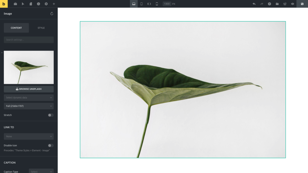
Element Image: Content Tab
Content controls are not only for visible text. They can also control semantic tags, attributes, query settings, form behavior, media sources, links, and dynamic data.
Style controls
Section titled “Style controls”Style controls affect the CSS Bricks generates for the selected element, active class, active selector, active pseudo state, and active breakpoint.
Style controls are commonly grouped into:
- Layout
- Typography
- Background
- Border / Box Shadow
- Gradient / Overlay
- Shape Dividers
- Transform
- CSS
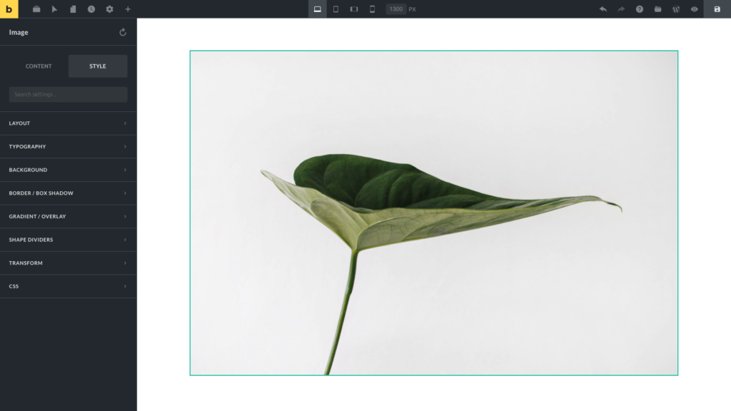
Element Image: Style Tab
Before changing styles, check which selector is active at the top of the panel:
- If the element ID is active, styles apply only to that element.
- If a global class is active, styles apply to that class everywhere it is used.
- If a pseudo selector is active, styles apply to that selector state.
- If a breakpoint is active, responsive style values are stored for that breakpoint.
This is the most important styling habit in Bricks: select the target first, then change the control.
Classes, selectors, and responsive edits
Section titled “Classes, selectors, and responsive edits”The selector area above the Content/Style tabs controls whether you are styling the element ID, a global class, or a selector/pseudo state.
Use global classes for reusable styling. Use the element ID for one-off styling. Use selectors and pseudo classes when styling states or child selectors.
Responsive edits are controlled by the active breakpoint in the toolbar. A control indicator can show when a control has a value at the active breakpoint or another breakpoint, depending on your builder settings.
Bulk editing
Section titled “Bulk editing”You can select multiple elements with Cmd/Ctrl or Shift selection. Bulk editing is useful for shared style changes, class assignment, moving, hiding, deleting, and some context-menu actions.
Bulk editing has limits:
- Bricks calculates the settings shared by the selected elements.
- If selected elements have different values, the shared control can appear empty.
- Editing a shared setting applies that change to the selected elements.
- If different element types are selected, Bricks shows only the Style tab.
- Some actions are disabled in bulk mode, such as saving as a Component or Template.
- Bulk wrapping only works when selected elements share the same parent.
Use bulk editing for broad, predictable operations. For content-heavy edits, edit one element type at a time.
Hide, conditions, and interactions
Section titled “Hide, conditions, and interactions”Element-level hide settings, conditions, and interactions are opened from the element panel header when available.
- Hide element can hide an element in the builder, on the frontend, or both.
- Conditions control whether the element should render for the current request.
- Interactions attach frontend behavior to triggers and actions.
These panels are permission-gated. If you cannot see them, check Builder Access.
Components and locked editing states
Section titled “Components and locked editing states”When you select a Component instance, Bricks shows instance controls and exposed properties instead of treating every nested element as local page content. To edit the Component definition, enter Component editing mode.
Some elements may also be disabled through the Element Manager or unavailable because their element type no longer exists. In those cases, Bricks shows a notice instead of normal controls.
Legacy Global Elements can still appear on existing sites. Bricks marks them as deprecated and recommends Components for new reusable content.
How To Reset Controls
Section titled “How To Reset Controls”Controls that have a stored value show a small indicator next to the control label or group label. Hover the indicator to reveal the reset action.
You can reset:
- A single control.
- A control group, such as Typography.
- Element ID styles.
- Active class styles, if you are styling a class and it is not locked.
Resetting style controls removes the stored style values for the current target. It does not remove content such as text, links, form fields, or image selections.
When styling a global class, resetting styles affects that class, not only the selected element.
Copy & Paste Styles
Section titled “Copy & Paste Styles”To copy and paste element styles, right-click an element on the canvas or in the Structure panel to reveal the context menu. Use Copy Styles, then select the target element and use Paste Styles.
Style paste respects the copied style data and the current target:
- Pasting element styles applies copied style settings to the target element.
- Pasting global class styles applies copied class style settings when a class is the active target.
- Shape dividers, custom CSS, and other complex style controls are handled as style data when supported.
For more copy and paste actions, including classes, conditions, interactions, and attributes, use the Context Menu.
Practical editing checklist
Section titled “Practical editing checklist”Before making a change, confirm:
- The correct element is selected.
- The correct selector is active: element ID, class, or pseudo selector.
- The correct breakpoint is active.
- You are editing Content for markup/data changes or Style for CSS changes.
- You are not accidentally editing a Component definition when you meant to edit an instance.
- You have saved before testing frontend behavior.
Was this helpful?
A quick vote and short notes help us improve these docs faster.
Leave a note for us
Please do not include passwords, license keys, or personal data. We store submitted notes to improve the docs.
Thanks for sharing feedback. We're using it to improve these docs.