Product Variation Swatches (WooCommerce)
Bricks 2.0 introduces Product variation swatches, giving you more control over how product attribute options (i.e. color, size, pattern) appear on the frontend.
Instead of dropdowns, you can now display your product variations as color swatches, image buttons, or custom labels, creating a more visual and intuitive shopping experience.
This feature integrates directly into the Add to cart element, letting you style variation swatches exactly how you want, without the need for extra plugins.
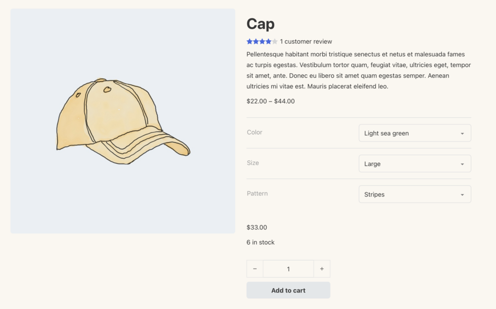
Before Product Variation Swatches
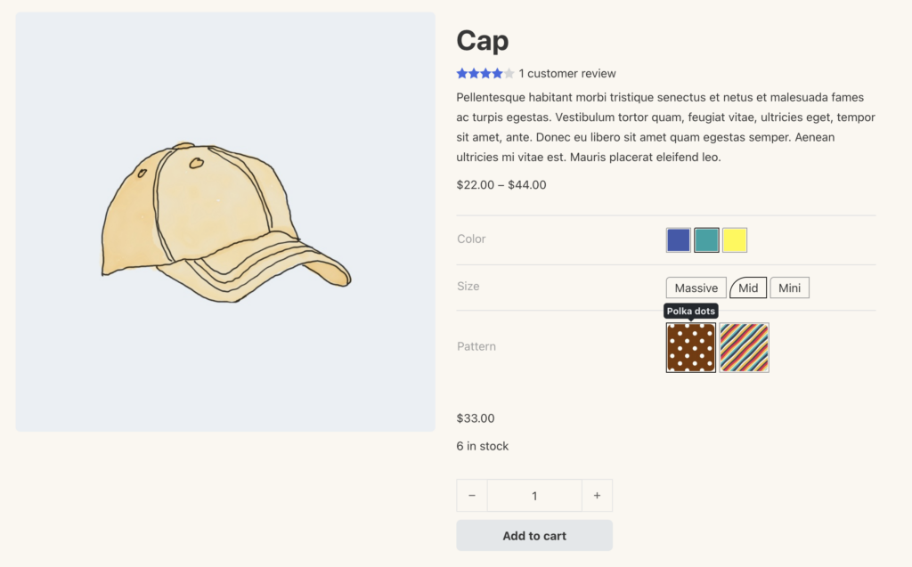
After Product Variation Swatches
Enable product variation swatches
Section titled “Enable product variation swatches”To get started, go to Bricks > Settings > WooCommerce > Enable product variation swatches.
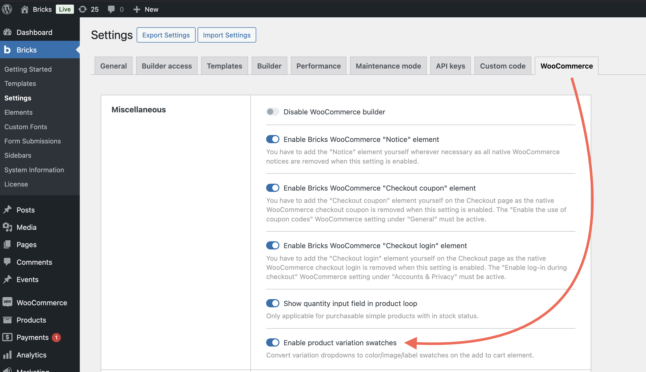
Once enabled, you’ll be able to customize variation swatches directly from your product attribute settings.
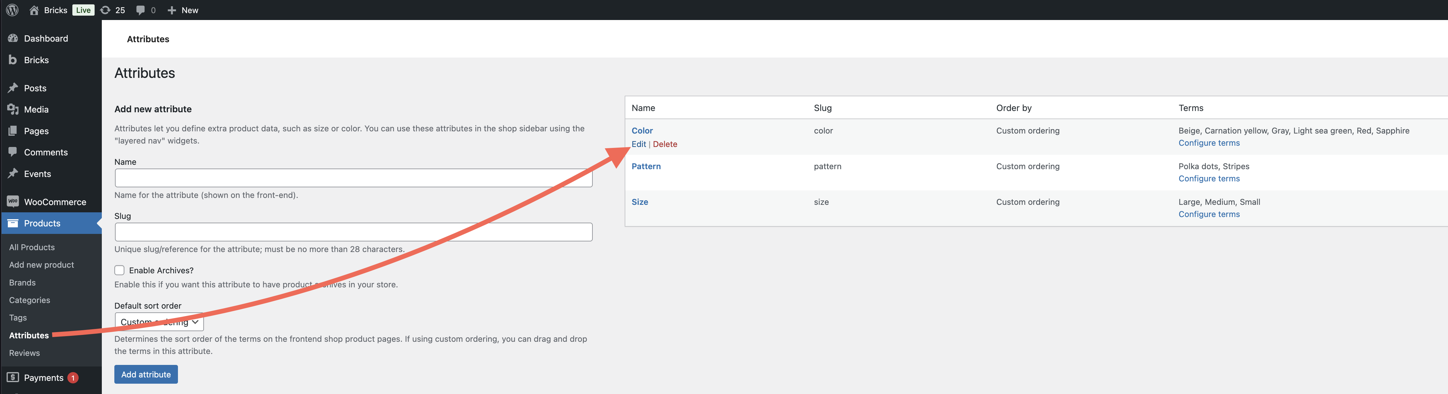
Assign a swatch type to product attributes
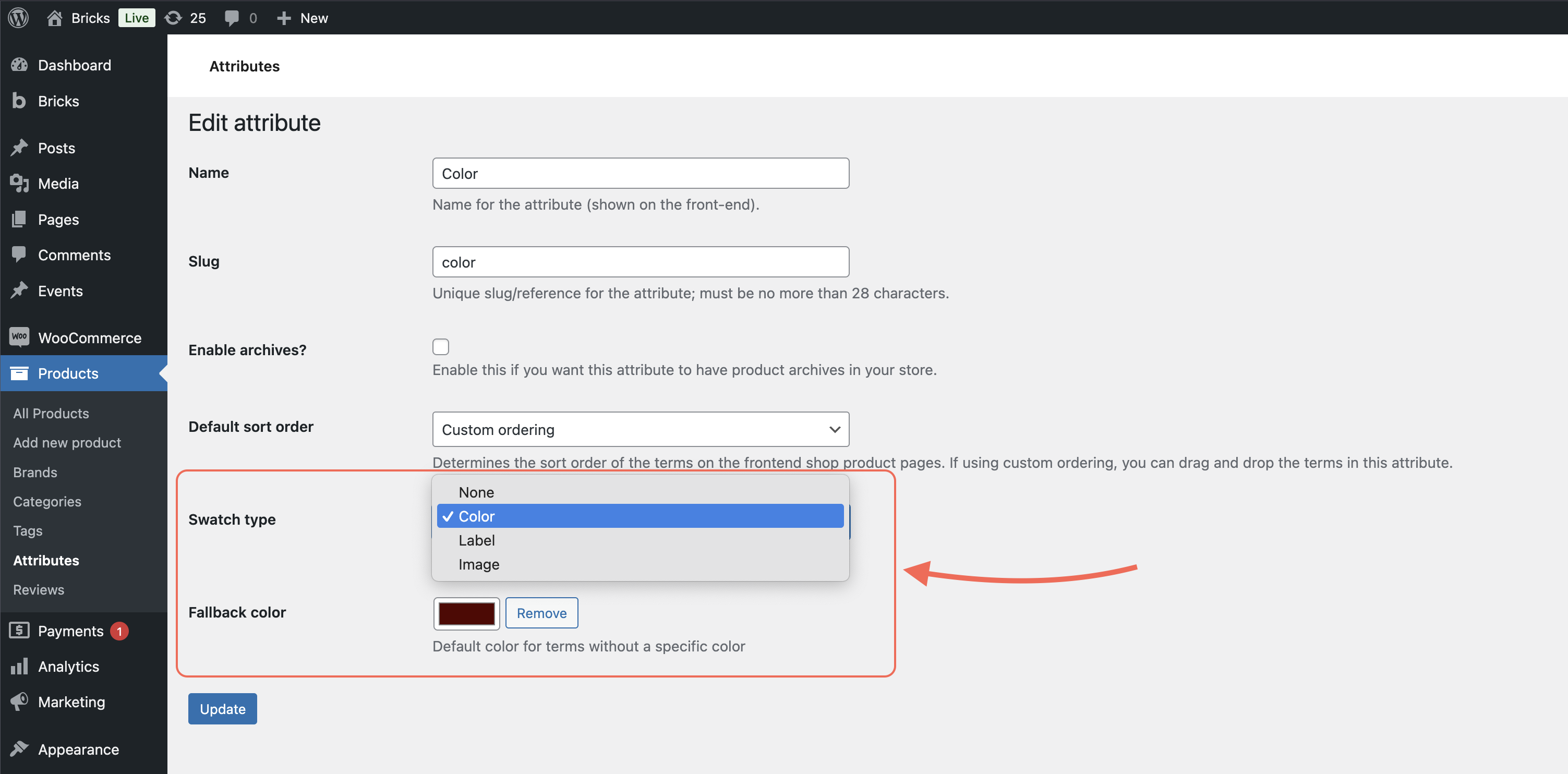
Section titled “Assign a swatch type to product attributes”Go to Products > Attributes, and click “Edit” on an existing attribute (or create a new one).
You’ll see a new Swatch type setting with the following options:
- None (default): Standard WooCommerce behavior (dropdowns)
- Color: Displays swatches using color values
- Label: Displays custom text labels for each term
- Image: Displays swatches using images from your media library
Example: Use the “Color” swatch type to show red and blue color boxes, or choose “Label” for size options like S, M, L.
Set a fallback value (optional)
Section titled “Set a fallback value (optional)”While editing the attribute, you can also set a Fallback value. This fallback will be used if a specific term doesn’t have its own swatch value.
For Image swatches, Bricks checks images in this order:
- The image assigned to the individual term.
- The matching product variation image, if Use product variation image is enabled for the attribute.
- The attribute fallback image.
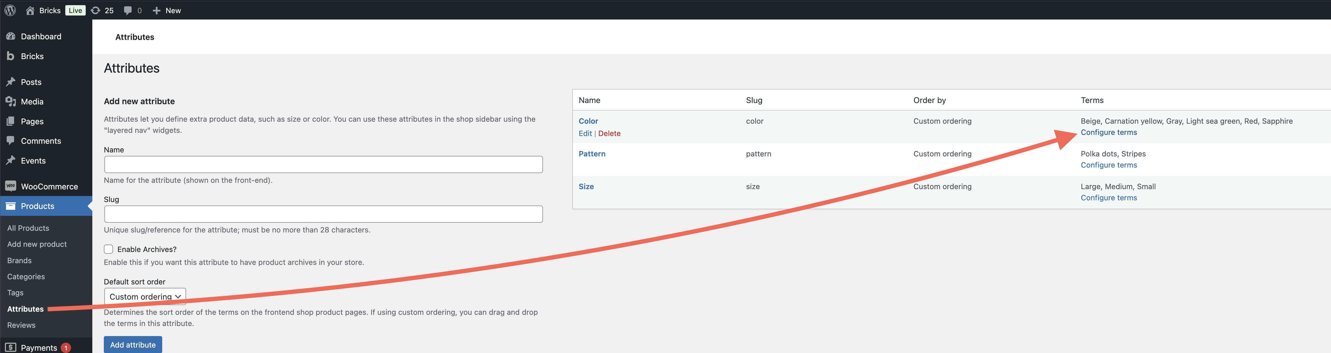
Assign swatch values to individual terms
Section titled “Assign swatch values to individual terms”Next, click Configure terms for the attribute you just edited.
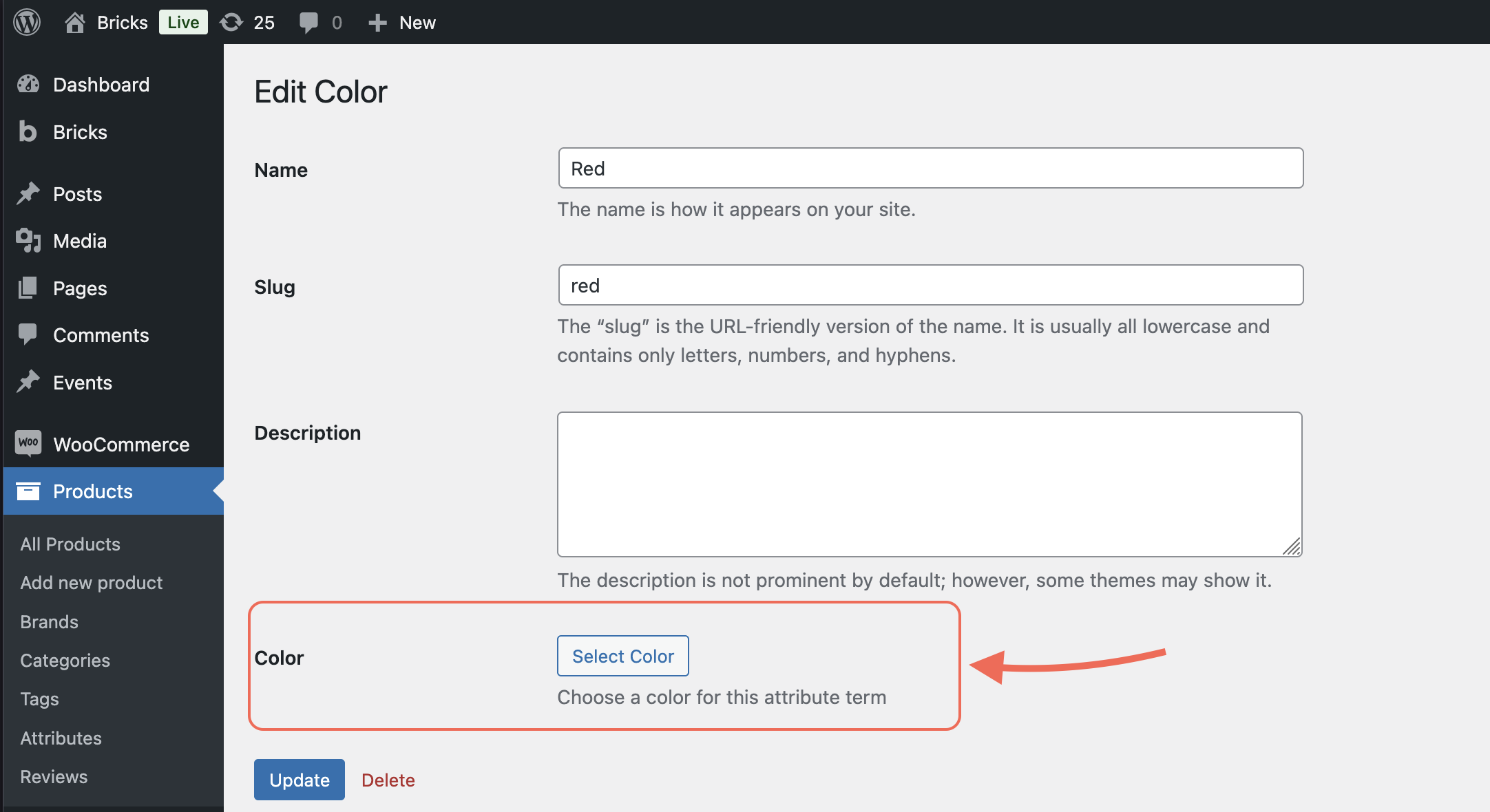
Then, click Edit on a specific term (like “Red” or “Large”).
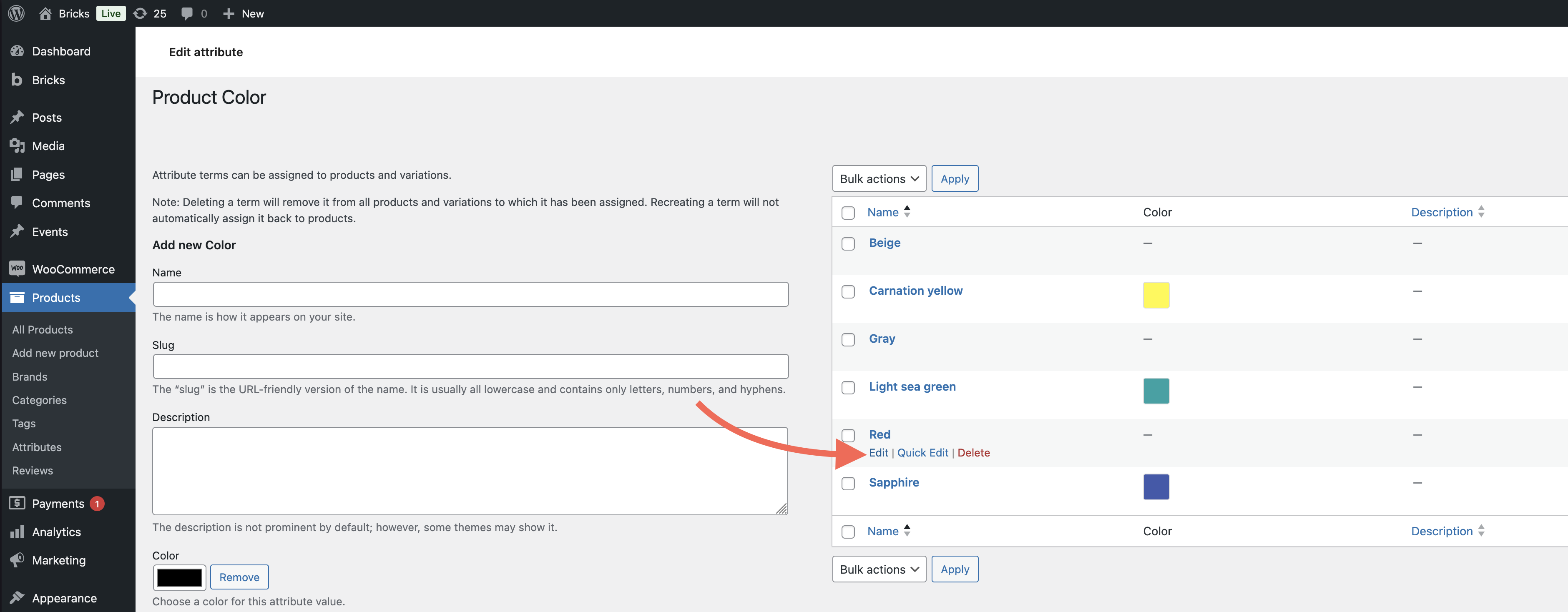
For each term, you’ll see a new input that matches the swatch type:
- Color → Choose a color
- Image → Select or upload an image
- Label → Add custom text
These values are what will be shown on the frontend in the Add to cart element.
Style swatches in the Add to cart element
Section titled “Style swatches in the Add to cart element”Variation swatches are rendered inside the Add to cart element, as long as your product uses attributes with a swatch type.
To style them:
- Select the Add to cart element (e.g in your single product template)
- Open the new Variation swatches group in the element settings
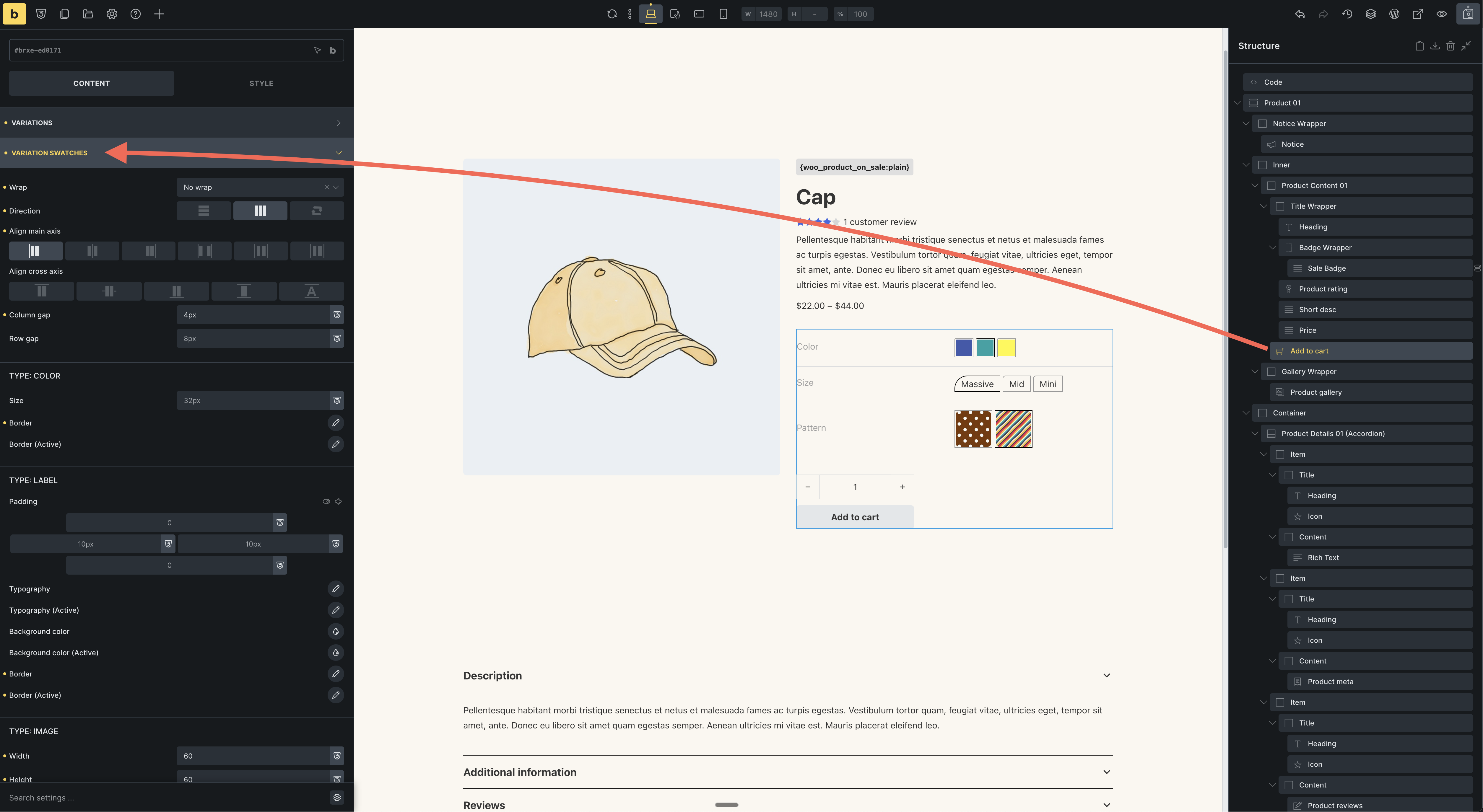
From there, you can adjust the size, spacing, borders, active states, tooltips, and more.
That’s it. With variation swatches, you can now turn standard variation dropdowns into polished, interactive product selectors, designed your way, directly in the Bricks builder.
Was this helpful?
A quick vote and short notes help us improve these docs faster.
Leave a note for us
Please do not include passwords, license keys, or personal data. We store submitted notes to improve the docs.
Thanks for sharing feedback. We're using it to improve these docs.